Categories
i'm Maggie
Your average Canadian, who loves hot tea, hates socks and helping your business have a show-stopping brand and website
Branding
Design
Websites
About Maggie
Why You Need Brand Photos On Your Website
HONESTY TIME!!! I’m about to spill the tea… so get ready!!!☕️
You NEED to have brand photos taken for your business.

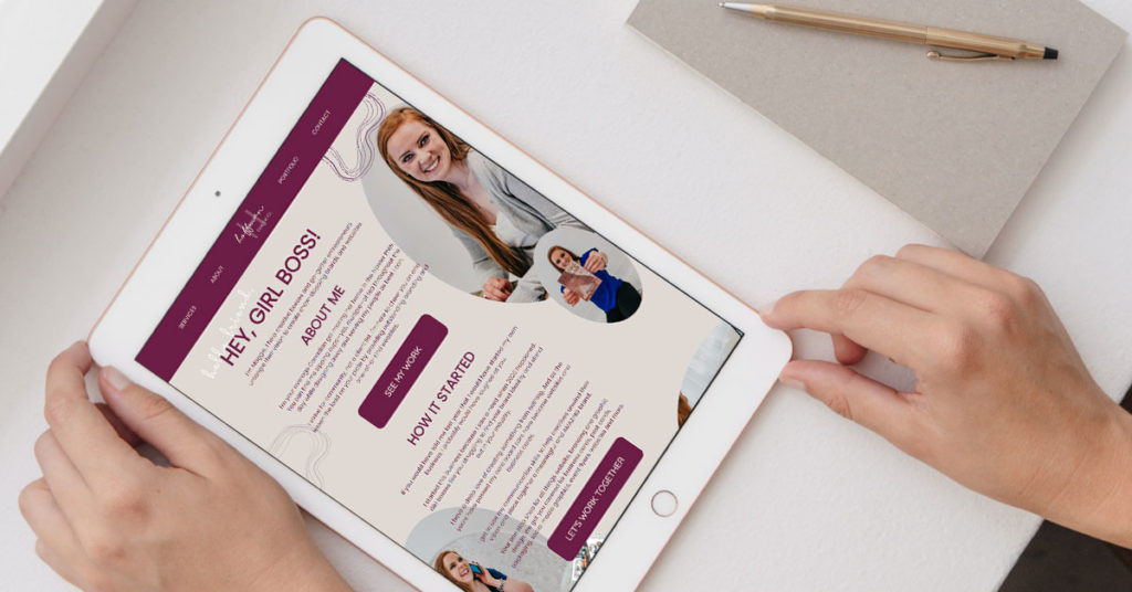
I can’t tell you how many times I’ve had to remind my clients that their website needs to have THEM on it.
While you don’t have to be on every page, your ideal client wants to know YOU!
People purchase from those they know, like, and trust. Adding photos of yourself to your website helps build up your credibility to be known by ideal clients.
If your website only has stock images stuffed into every page, chances are your ideal client will click off it because they don’t see a genuine person they can recognize.
I’m sure if you’ve visited a few websites you’ve seen those stock images and felt disconnected, right?
What Type of Photos Do You Need?
Now you might be thinking “Maggie, I don’t want to plaster my face on my website.” I understand that. There needs to be a balance.
But if you only have one photo of you on the website, chances are ideal clients are missing out on knowing YOU.
And not all of them have to be professional, too. You can have some selfies. But, make sure to mix both selfies and some professional ones.
Just try to make sure your selfies aren’t too blurry. You will want high-quality photos. This doesn’t mean the content in the image is high quality—although, you are MIGHTY fine. I’m talking about the image resolution and size. You don’t want to add a tiny website image to a large canvas. It will become grainy and pixelated.
I recommend getting some photos taken professionally, and having a few really good selfies that you can use on the site too.
Styled Brand Shoots
When your budget allows, I recommend hiring a photographer and setting up a styled shoot. Bring lots of props, and outfits, and see if you can change location a few times, too!




These photos are multi-purpose. You can use them across social media, and your website! You will start to develop a collection of images that you can rotate through and use across all platforms.
Be sure to get a few fun ones that show your personality, and a few headshots that you can use as bio pictures for interviews, or share with another creative you work with.
Share What You Do!
And while we’re on the topic of website images… be sure to put examples of YOUR work!
Your ideal client wants to see what you’ve done—weddings you’ve shot, cookies you’ve decorated, art you’ve made!
I find that having updated photos of you and your work every quarter or half year is best! This way you can refresh your website and cycle in new work on all platforms.
Don’t only rely solely on stock photos.
And before you feel ashamed, don’t. I too once had far too many stock images on my first website. But I also had my husband take photos of me with my DSLR camera to have a few of my face for the website.

Where to Put Photos of Yourself?
Now you may be wondering, “Maggie, I have these photos, but where do I put them?”
Great question! I would say if you are starting out and only have some selfies of yourself, or the professional ones, put at least one photo of you on your home page, about page, and contact page. Those are the most common places people will visit, and seeing your smiling face will welcome them into a relationship with you.
If you have stock images, try to keep them to a minimum and sprinkle them throughout the services page, and other supporting pages that will be clicked on, but the image content won’t matter as much as an about page. You don’t want to have stock images of other people on your about page, people want to know what you look like!
If you are able to get photos of your work, showcase those across all pages! Make sure you have some action shots, and photos of the pieces you’re most proud of. Put those on the home page, services page, and portfolio page.
Problem With Stock Photos
I sometimes leave sites if I don’t see any photos of that person on their site, or if I see a lot of generic stock images. I want to strongly encourage you to not use stock images. Because they don’t feel authentic. They don’t share your vision. They aren’t YOURS (even if they are free to use).
I know we all have to start somewhere. But when you’re able to invest in some photos, do it!!!
Here are some great places though, where you can get free stock images.
We all start somewhere. And that is nothing to be ashamed of. But making sure your website has sprinkles of you and your work throughout the site will help bring clients.
Where to Get Brand Photos
I’ve been fortunate enough to work with some AMAZING photographers. These photos have been taken by Cassie Newquist and Amy Winsor. You can simply search for brand photographers on Instagram or Google. And if you’re in Oregon, I have a few more photographers I can share with you!
My hope in sharing this is to show the importance of having your face on your website, highlighting the work you do.
And once you get those images, your web designer will thank me for it, too.😉
What’s something you love seeing on someone else’s website?👇🏻👇🏻