Categories
i'm Maggie
Your average Canadian, who loves hot tea, hates socks and helping your business have a show-stopping brand and website
Branding
Design
Websites
About Maggie
Website Highlight: Pillars of Hope Counseling
I’m excited to share with you this new website project I built for Pillars of Hope Counseling, here in Oregon.
Angelie and I connected back in April and began working quickly on updating her website. We moved her over to Showit and built out a custom WordPress blog as well.
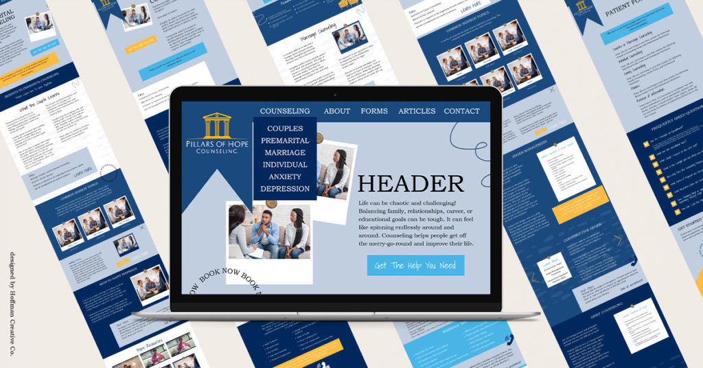
Initial Website Designs
While talking through her website redesign we chatted about having an eye-catching website that would draw in her ideal client.
I worked on building a site that highlighted her brand colours and created some movement on the page to keep viewers on it longer.

Since Angelie had already written her website copy, I was able to design her site around the important pieces of information and ensure that the web visitors were able to find that fast.
Website Revisions + Additions
As we progressed through the website build, Angelie wanted to make sure the copy was the star of the website. So we removed a few of the artistic elements I had added to give the copy space to breathe.
I appreciate it when clients share their visions with me. It makes it REALLY easy to build the site out and also ensures it is targeting their ideal client.
Image Search for Websites
Another big piece of websites, besides the copy, is the images. While Angelie is a counselor, we wanted to be mindful of the privacy of all her clients. So we went to places like unsplash.com and shutterstock.com where we gathered a mixture of paid and free-to-use images.
Images help tie the website story together. So we found images that helped convey the topics of counseling Angelie provides, while also not selecting images that her ideal client could see themselves in.
Final Website Design
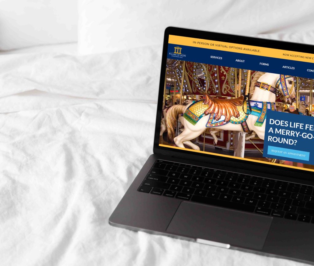
I love being able to see where my first drafts of a website lead me and my client in the design process. We ended up restructuring the homepage slightly to increase traffic and booking. You can check out the new site here, and let me know what your thoughts are!
To elevate the client experience, we added several ways for clients to book with Angelie throughout the site.
Being able to have a crisp, easy-to-navigate homepage is always my goal when I work with clients, and I think this was achieved with this one.

Overall, the whole website project took about two and a half months to complete. We were able to launch the site back in June. I was able to move over her domain and ensure her site was up and running smoothly when we launched.
This was a really large project for me, and one that I’m proud to have accomplished. I am grateful for clients who trust my guidance, advice, and experience when designing their websites.
Is it Time For A Redesign?
I know that the website redesign process can be overwhelming, but I do my best to communicate and walk alongside each client to reassure their fears and let them know they are in good hands. I’m so grateful for each client who trusts me with their project, it’s something I don’t take lightly.
If you are looking to get your website updated, I’d love to connect with you and build out your dream site. I am taking on a few more projects in 2022 before my maternity leave in November. Fill out my contact form and we can get started!