Categories
i'm Maggie
Your average Canadian, who loves hot tea, hates socks and helping your business have a show-stopping brand and website
Branding
Design
Websites
About Maggie
Brand Highlight | Finding Freedom Financial Services
Alright friends, this is a brand that I am PUMPED to share with you!! Megan and I met in a Christian Mompreneur group (entrepreneurs who are also mothers), and earlier this year, she mentioned she was looking for a rebrand. We quickly connected over Instagram and then chatted more over Zoom. Shortly after, she hired me!
Megan is a Midwest-based bookkeeper at Finding Freedom Financial Services and is doing such an amazing job serving her clients by helping them navigate their finances, especially their taxes. While we chatted in the initial stages of her redesign, she mentioned she was looking to shift her ideal client a bit. She detailed that her goal is to become a bookkeeper for cute boutiques and retailers, so she wanted to customize her brand to make her services desirable to that audience!
I was super excited to work with her because of her passion for serving others and her mission that drives her business. As her business name illustrates, she works to help take away the fear that so many business women have from the financial side of their businesses!
Initial Brand Concepts
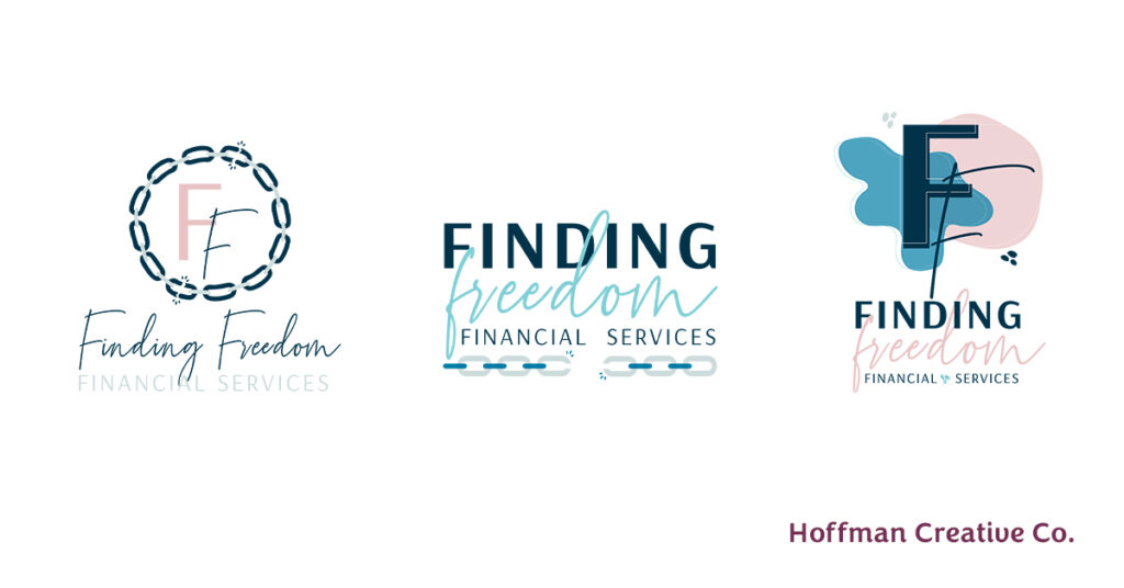
Megan knew she wanted to stick to a similar look of her previous logo by using a cursive font. She also knew that she wanted to her brand to become more text based rather than icon driven.
She wanted her new brand to be unique and feminine. We began by pulling colours that could reflect her brand voice and attract her ideal client. We landed on various shades of blue with pink for an accent.
Then, we played around with the idea of making an acronym within her logo since her business name has a long name. We also played around with if we wanted any icons to be included that reflected the concept of “freedom.”

Back to the Drawing Board
While these initial concepts were good, they were not what she was looking for—which is totally acceptable in the design process! My approach to design ensures for each of my clients that we are headed down a path that complements both their vision and speaks to their ideal client.
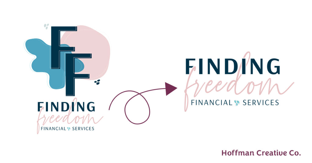
We pivoted away from using icons, and I created a little “splotch” that both Megan and I felt was feminine and fun.
I started to build out more of the brand using those little splotches and developed a cute new vibe that reflected what Megan was envisioning.

Building out Brand Assets
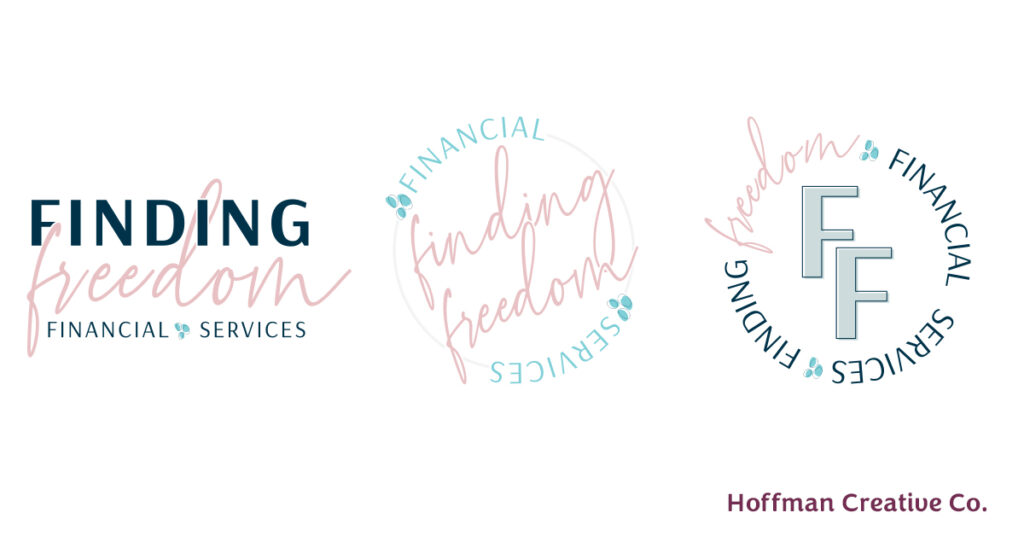
In all my brand packages, I offer the design of two additional logos since one logo may not always fit every medium. For example, a rectangular logo won’t fit well inside of a circular medium, such as an Instagram bio. So, I give my clients additional logos they can use in a variety of areas. I also give my clients their brand elements in different colours and file types so they can be used multiple ways and fit any project!
“Wow, so many elements, thank you so much!”
Because Megan had mentioned at the beginning of her project that she wanted a circle logo, I made sure included a circle element in one of her variations. I also made sure to accent different colours in each logo to help them stand out while also emphasizing her new brand identity.
“Oh my goodness, I love this all so much! I’ll be spending the evening getting my brand kit all set up in Canva. Also, already planning a trip to Office Depot so I can get this professionally printed and bound lol.”
Comments like this make my DAY, especially when clients PRINT the work I send them. It’s a designer’s dream!

Designing Marketing Materials
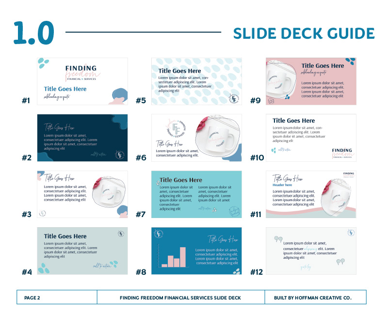
Along with the new brand and logos, Megan requested some slide templates for a project she will be launching this year.
Once I finished up the brand logos, I had some fun by putting the pieces into practice! I had such a great time doing this—it’s not usually something I get the chance to do. I usually get to design the brand and one piece of collateral (typically business cards), and then I pass off the designs back to the business owner to create their own marketing pieces.
But, this time I got to play and have some fun using the elements I created. After I made her templates, I shared them via Canva for her to replicate and use. And if I do say so myself, they turned out really lovely.

Included Website Audit
The last item Megan and I worked on was her website audit. I went into her website and looked over every page in order to provide constructive criticism. I also looked at ways she could improve user experience and make it easier for users to find what they are looking for.
I love giving audits because I’m able to give ideas and help non-web designers learn some fun tricks. If you’re curious about a website audit, message me, and I can complete one for you!
“Thank you so much…I will be continuing to implement some of the changes you recommended in the website audit.”
Final Finding Freedom Financial Services Brand
It truly was SO amazing to work with Megan and building her a new brand that I know will help her provide more financial freedom to boutique owners. I love the way the brand came to life, and so did Megan!
“Before working with Maggie, my branding was stale and no longer represented how my business has shifted over the last 5 years. I tried making revisions and updating it on my own, which lead to very inconsistent results. Hiring Maggie was one of the best investments I could’ve made! She was able to capture exactly what I want my brand to convey, and how I want my audience to feel when they think about my brand. The process went very smooth, and she was great at understanding my feedback, even when I wasn’t great at communicating them myself (hey, I’m a numbers person, not a words person! lol). I’m also getting positive feedback from some of my audience saying they LOVE the new look, and I’ve even started receiving a higher number of leads since implementing the new brand across my website & social media! Thanks Maggie!”
If you want to chat about getting a brand refresh, website audit, or help with designing marketing materials, pop into my inbox, and let’s bring your dream into reality!