Categories
i'm Maggie
Your average Canadian, who loves hot tea, hates socks and helping your business have a show-stopping brand and website
Branding
Design
Websites
About Maggie
What Are Design Standards For Your Business, and Why You Need Them
First, let’s talk about what Design Standards are. When you think about a business, and how it displays its visual brand, there is a certain set of rules on how to use the brand. Those are Design Standards.
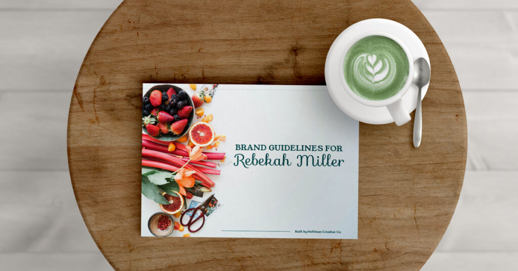
While this may all sound technical and rigid, it isn’t. I like to tell clients that these design standards, are what help you be creative. You have a sandbox to play in and you can do whatever you’d like within that box. The same is true with these Design Standards. You have rules to follow, but you can have lots of freedom with your designs, once you know the rules.
Why Have Design Standards?
These standards are also super beneficial when you hire new staff or outsource something in your business. It gives those individuals the rules, so they can also join you in the sandbox and create freely. At my former 9–5 job, I had to read through a 50-page document on how to use their brand, colours, fonts, and imagery. It was intense, but then as I got to designing and playing, I knew what to do. There weren’t some hidden rules I had to guess. But a standard of what all marketing should look like, feel like, and fit within.
It gave me clarity on my designs. Uniformity, and a sense of cohesion. The pieces I was making for my former employer fit within the overall brand here in Oregon, but also in the United States.
What Do Design Standards Include?
Now I want to write”Brand Standards” only because this pertains to the whole brand and how it should be perceived. But I want this blog post to stick with design standards, as you as a business owner are likely creating graphics, pins, booklets, guides, posts, and more. And are likely curious about the visual design standards, versus the brand standards.
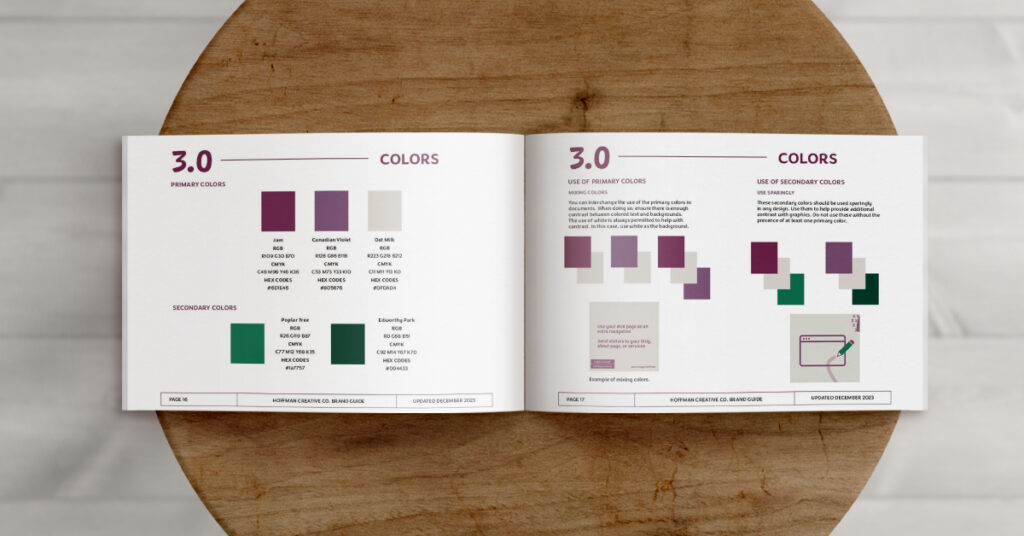
Most Design Standards include pieces on
- How to use the colours, and where.
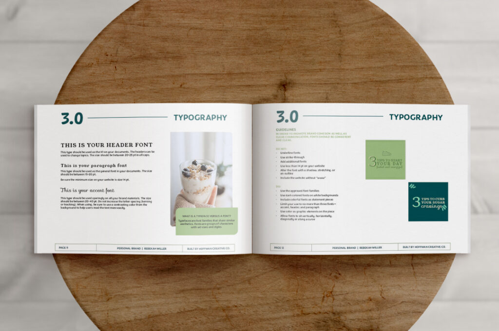
- How to use the fonts, and where.
- What Elements to use, and how
- How to use your logo, what is acceptable usage
- What style of images or illustrations to use
Sharing Your Guidelines
What you may not know, if you are outsourcing some design work, is that not all designers use the same platforms, and don’t have access to your brand fonts—unless you purchase an additional license. Learn about font licenses here.
If you are using an external resource and they don’t have access to your brand fonts—without a new license—your brand can have two fonts, one for internal use (when you have a license) and one for external use (a free font, or different font that is easily accessible). For example, I use Adobe to design all my work. However, my assistant, or Pinterest Manager uses Canva. And while they could purchase my fonts and upload them. I have a Web Font that I approve of and have it on my website, and these women have access to it.
Similar to fonts, are brand colours. You want to make sure you have the correct colour codes shared with your team so that they’re using the right color on the right platform. For example, using the RGB codes on all digital platforms—even if you’re designing on a computer, think about the end product and where it will be consumed. And using CMYK for all print materials.
Design Standards go beyond fonts and colours, but also approved imagery, illustrations, and how to use the brand logo.
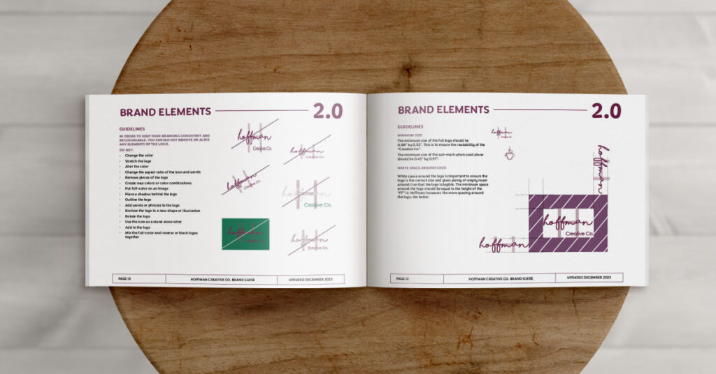
Guidelines on Using Your Brand Logo
You may be wondering, “Maggie, do I need guidelines for how to use my logo? I know to put my logo on things I create—booklets, business cards, my website. What other guidelines are there?”
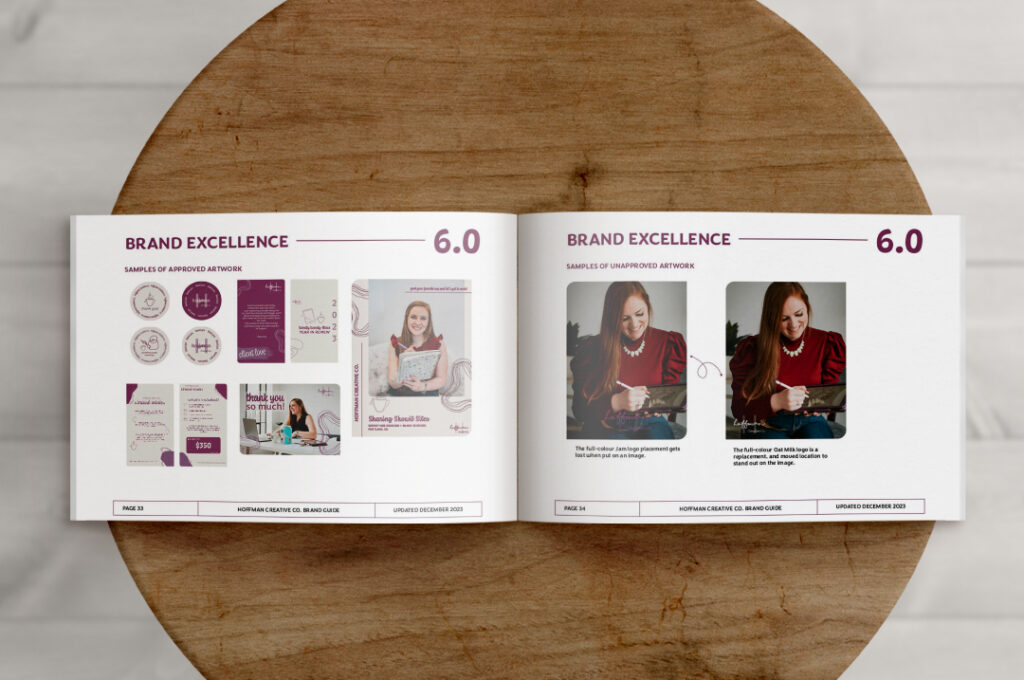
Well, let me share an example with you. Say you have a beautiful full-colour logo, something with three colours, that you paid good money for. Then you put that logo on top of an image which will be the cover of your new client information packet. But now, your logo gets lost, it looks poorly laid on that image, and you have a hard time looking at it.
Or take this example, you are a wedding photographer and you gift your couples USBs with their images. You want to add your logo to the outside of the USB. You get it printed and delivered to you. Only to see that the beautiful delicate pieces of your logo are too small and hard to read. Your logo now looks like a blob and is unrecognizable.
These examples, are exactly why you need guidelines on how to use your logo. To have specific rules on where to place your logo, the size of your logo, and which logo to use when you have a very small surface area.
How to Get Brand & Design Standards For Your Business?
Working with a designer, like Hoffman Creative Co. you will receive a document full of brand and design standards. Laying out how to use your visual elements and ways to uphold your brand when it’s shared. I work with business owners to provide basic standards for their brand’s visual identity. And I’m happy to add in additional notes about the overall brand and how to use it, present it, and talk about it.
All Hoffman Creative Co. clients receive a custom document with these guidelines laid out. In hopes for you to display the beautiful brand, we worked hard to make.
Branding isn’t only about visual identity, but how your business as a whole is perceived. Having Design Standards makes sure your business’ assets are treated the same across any medium, which builds credibility. And running a business that has credibility is what you want, right?
What If I Don’t Have Design Standards, But I Want Them?
Great question, you can start to write down ideas, or ways that you want your visual identity to be upheld, and when you have enough, you can either make a document yourself or hire Hoffman Creative Co. to put your design standards into a polished document.
I highly recommend having one, so that you and all your team members can reference it. And ensure all the work you share is up to the same level, and created in the same sandbox. If you want to have Design Standards created for your business, reach out to me at maggie@hoffmancreativeco.com, and we can get started.