Categories
i'm Maggie
Your average Canadian, who loves hot tea, hates socks and helping your business have a show-stopping brand and website
Branding
Design
Websites
About Maggie
Website Highlight: Fox Hollow Family
This is a site I’m SO excited to share with you! It’s for a child care centre in Canada. Nova Scotia to be specific (where I went to university). This was such a fun project and one that made me feel at home.
Before We Began The Web Design
I got connected to Leanne, the Director of Fox Hollow Family through a friend I met while in university. Leanne was looking for a new website because she felt her old site was hard to navigate and didn’t show much of its brand as a welcoming, nature-based centre.
Fox Hollow Family provides two offerings to families, so they needed their client journey very clear and easy to follow from the home page. The previous site made web visitors choose right away when they entered the site, but it lacked some branding, and core values that Leanne wanted each user to experience.
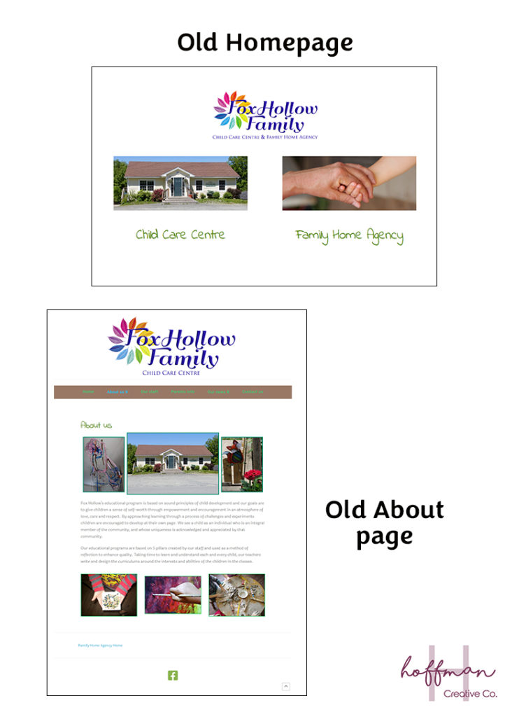
I shared some ideas on how we could keep the same goal—having visitors filter through which area they needed to learn more about, child care centre, or family agency—while making it aesthetically pleasing and on brand.
Choosing New Branding
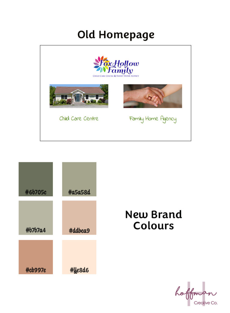
One of the pillars of Fox Hollow Family is nature-based learning. The old site had elements of nature weaved throughout the site—leaves, images, and text. But the site colours and overall feeling lacked consistency and didn’t tie in with the pillars.
So Leanne and I worked on creating a new colour palette for Fox Hollow Family to tie their pillars together visually. We landed on a nature-forward palette that also is unique among other child care centres—ultimately helping them stand out since they are not relying on the three primary colours you’d traditionally see.
Website Design Process
I start all my website designs by sketching out on paper—I’m old school haha. Then I move over to Illustrator and start designing there.
Since Fox Hollow Family has two distinct client journeys I wanted to create a smooth pathway for viewers to choose their path. I figured making the hero section—top section—of the website divided into the two client paths, so it’s VERY easy for the user to find what they are looking for.
I also noticed on the previous site that once you were in one client journey, it wasn’t straightforward to go to the other—and I realize that not every client needs to hop between the two, but I wanted to make navigation easy for all users (and the Fox Hollow Family team).
Condensing Website Pages
Another piece in the web design process was reducing and merging some of the pages on the old site. Since I’ve been working in websites for a while I’ve seen an older way of thinking that you “need” to put SO much text on your website and have pages with only a few sentences. This thought came from improving your SEO, and having a larger website to appear more credible. But, that isn’t how I design, and I want to be strategic. Your website and user experience will be better if you have more targeted pages with the information your clients need.
So we worked to merge some pages that had similar content, again to make it easier for visitors to find what they are looking for.
Initial Design Drafts
I wanted to incorporate some fun visuals since it is a child care centre, yet remain professional and welcoming. I relied on shapes that would accent the page and not take away from the images or the content.
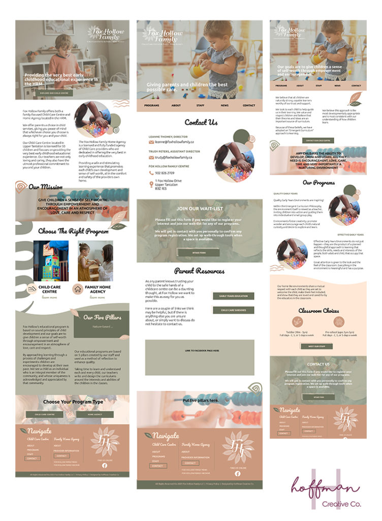
I sent off drafts to Leanne, and she loved them! It was so fun to see my vision come to life and match what my client was looking for.
Custom Pages
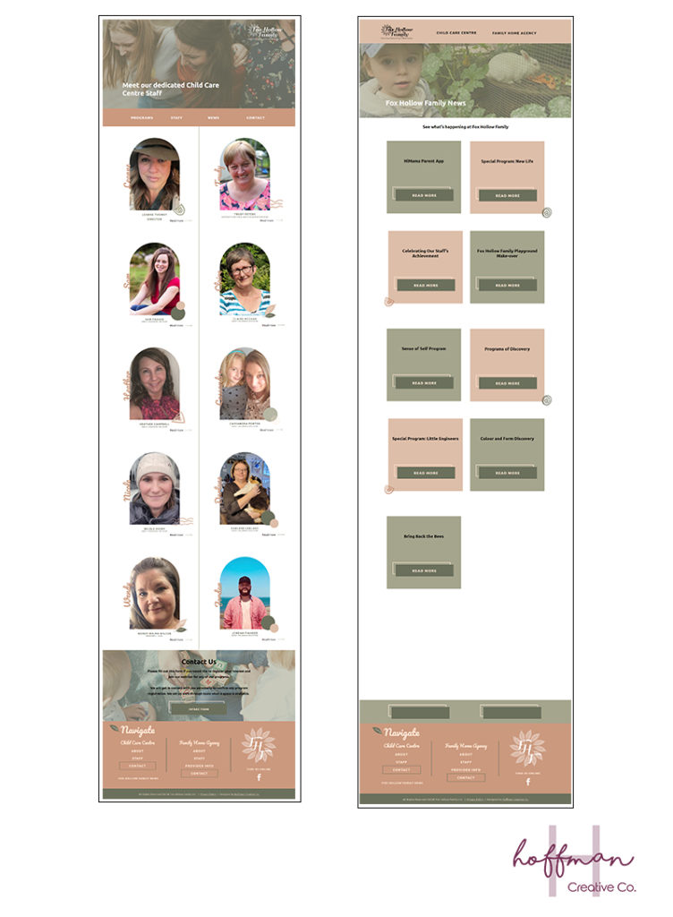
I wanted to have a really unique layout for the staff page that didn’t look like the normal pages you’d usually see. Since I work on Showit I knew there could be a creative layout without using custom HTML code.
I played around with a few different things until I landed on these side-by-side canvases for each staff. It was such a fun “problem” to solve and I love how they turned out in the end.
Another page that I was able to workshop on was the blog page. I wanted to have alternating post blocks that changed colours. I was able to get these to work with the help of Showit’s support team. But I love the layout of the posts.
What do you think about these custom page layouts?
Final Website Reveal
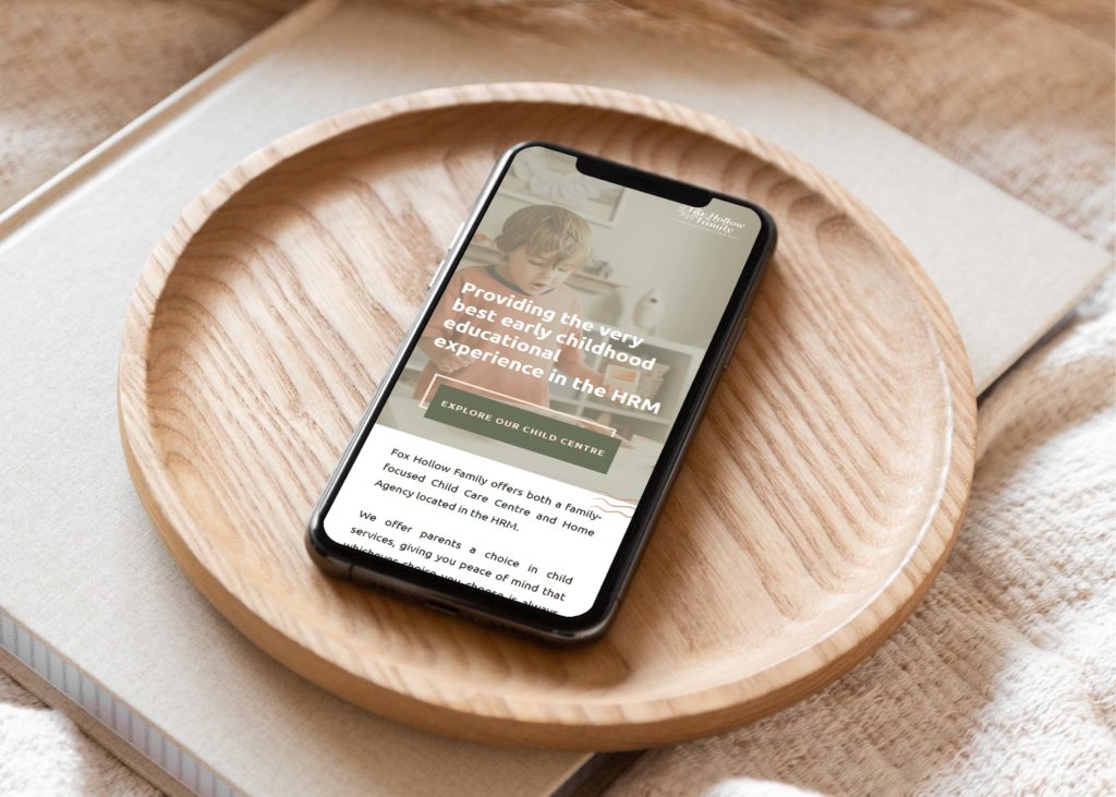
This website was truly so much fun to work on. And I absolutely love how it all turned out. Be sure to check out the whole site at foxhollowfamily.ca! Here is what Leanne shared about working together.
“Maggie truly took the time to get to know me and what I wanted for the redesign of my website. She was extremely accessible even though I live in a different country on the other side of the continent. She was lovely and patient and very knowledgeable. I would 100% recommend Hoffman Creative Co.”
Thanks, Leanne for trusting me on building your new site! I can’t wait to see how it benefits your business!
Want to Update Your Website?
If you are looking for a fully custom website design, I’d be honoured to help you. As a Showit Design Partner, I pride myself in providing unique websites that look and feel like you. Let’s chat about getting your site designed!