Categories
i'm Maggie
Your average Canadian, who loves hot tea, hates socks and helping your business have a show-stopping brand and website
Branding
Design
Websites
About Maggie
Website Highlight | Fortitude Public Affairs
I’m so excited to introduce fortitudepublicaffairs.com! This custom website is also paired with a new brand design for Holli Sullivan. Holli is the former Secretary of State of Indiana and just launched her public affairs agency.
Holli and I had so much fun working on her brand! I was really looking forward to building our her website using her new colours and elements. Check out her brand here.
The Starting Point
As with all my website clients, we started our process by looking at competitors’ websites. We spent time reviewing items Holli liked and disliked about these brands and websites. I also had us look at a variety of other websites for inspiration. This helped me get a better idea of what she likes and her vision for her business’s website. Holli really wanted her site to be bold, unique, and classy—similar to her.
After analyzing the visual aspects, we talked through site functionality and user experience. We had noticed both things lacked in some of her competitors’ sites, so we started planning how we could best layout her site in regards to best meet her ideal clients’ needs.
Initial Website Concepts
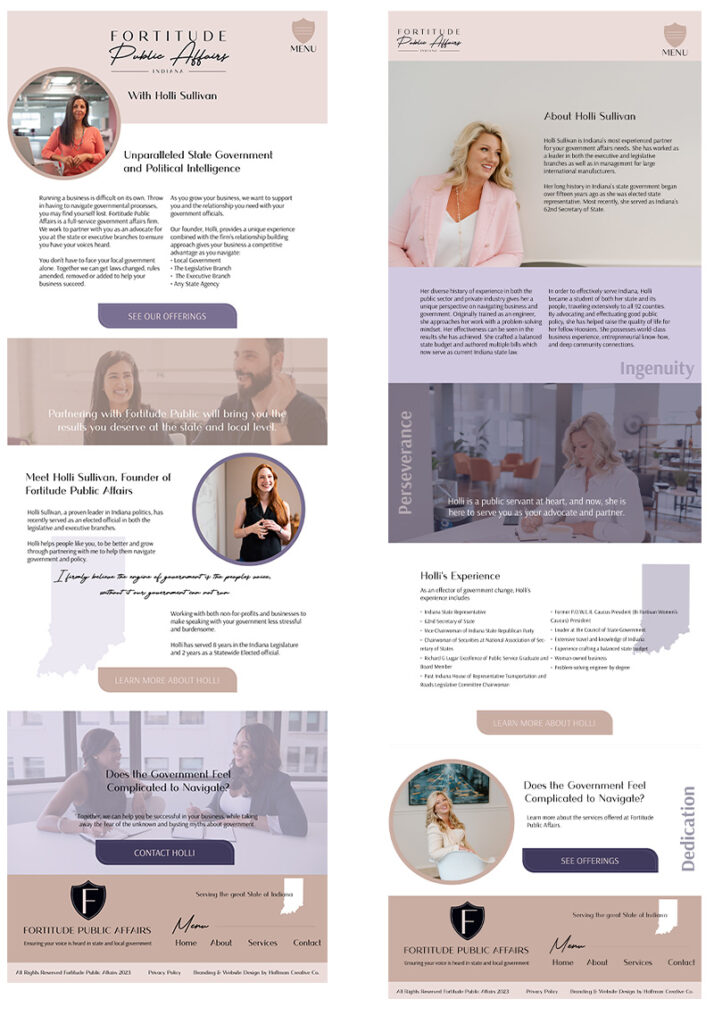
I always begin the website design by building mock ups for my clients and taking their wants into consideration. Holli was fairly open-minded, so I was able to really let my creativity flow.
First, I drafted a homepage with my pencil and paper. When I was please with that, I moved to creating them in my design software so I could send them over to Holli as images.
Since some of her competition tended to fill too much of the page, I knew I wanted to play with the white space. Holli had also gotten some new brand photos taken, so we definitely wanted to feature those. However, I knew I didn’t want to put her face on every inch of the site.
When I sent off the initial concept, Holli was so kind: “This is exactly what I was wanting…so far we are REALLY on the right path!!!”

Prelaunch Site
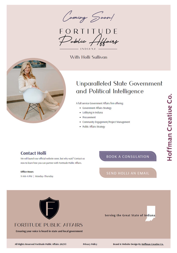
Holli was going to a networking event where she would be speaking before her site was set to launch. She wanted to have an active webpage to direct people to in order to contact her. I quickly built a “Coming Soon” page and set it up for prospective clients to interact with Holli and begin booking appointments.
“Coming Soon” pages are a really great tool to use when you are swapping out your old site for a new one, or in this case, letting people know your site is under construction but your business is still active and accepting clients.

Showit Website Customization
I set up Holli’s “Coming Soon” page in Showit and launched it before her speaking engagement. After Holli approved the mock-ups the rest of the site, I began developing them in Showit also.
Holli’s website turned out almost identically to her mock-ups, which was so wonderful because it showed we both had the same vision for her business. As a designer, I strive to always be on the same page as my clients!
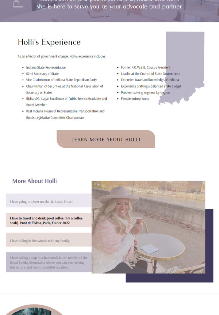
I built a totally custom Showit site for Holli and was able to highlight her various offerings in a bold and professional way.
One of my favourite parts of her website is the “About” page where I added a fun little section for clients to get to know her better.

Working Together
I truly love being able to work with so many talented women and showcase their unique personalities and businesses. I strive to make each website unique to them and their ideal client. Working with Holli was such a joy, and I am grateful she chose me to carry out her vision!
If you’re like Holli and want to start your business off on the right foot or are looking to add some life back into a brand that feels meh, I’m here to help! I’d love to work together and bring your vision to life!