Categories
i'm Maggie
Your average Canadian, who loves hot tea, hates socks and helping your business have a show-stopping brand and website
Branding
Design
Websites
About Maggie
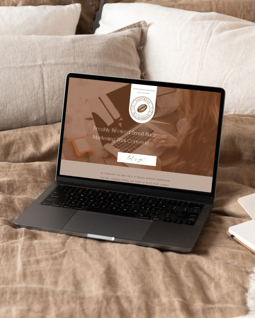
Website Highlight: CopyBean
I was SO excited when Christina from Copybean reached out to me to talk about designing her website.
Christina owns a digital marketing and content writing agency in LA, and we have become friends through a mastermind group with other female entrepreneurs.
She shared how her business was growing and the old website they built on Wix didn’t convey the brand voice she wanted. So she wanted a change to help bring her website’s appearance up to where her business is.

About Copybean
Christina gave this business the name Copybean because of a nickname she gave her son and her love for coffee.
She desired her ideal client to feel welcomed, cozy, and “everything you think about when you site at your favorite coffee shop” when they interact with her business. There was a slight disconnect between what their current website had to where she wanted them to be.
So I set to work on building a site that focused on those brand attributes while highlighting the excellence of Copybean’s work.
Building Copybean’s Brand
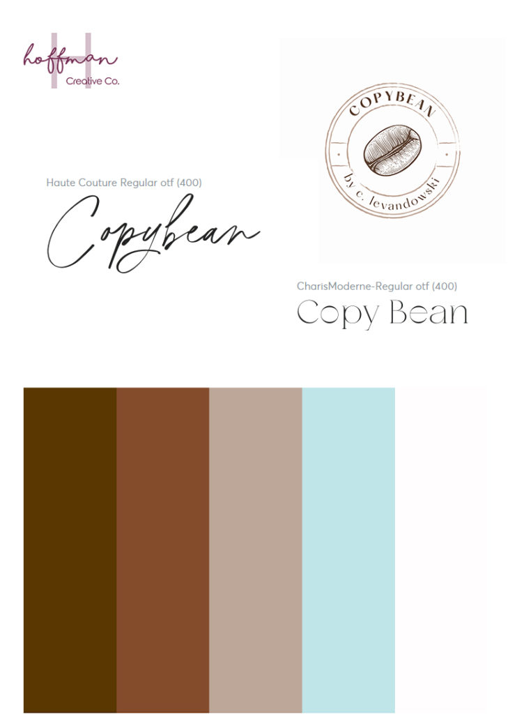
Christina had some brand colours already picked but was open to expanding the colour palette. Her colours were similar to shades of coffee, and we added a light blue to help brighten the palette. And the colour blue conveys trust, loyalty, and confidence—things Copybean stands for.
We also chose unique fonts that were minimalist, yet conveyed the brand voice Christina was looking for.

Building the Website
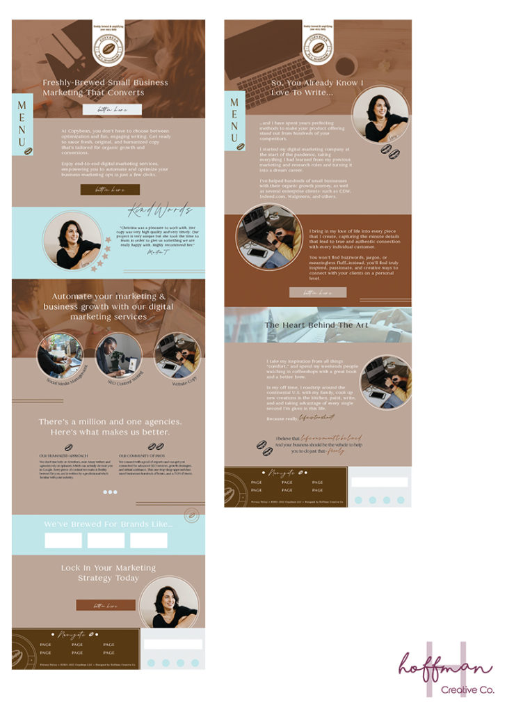
I started the design process by providing drafts to Christina, for her to choose what she liked. Once we were on the same page, I began designing the new site on Showit.
We were able to incorporate several different fun elements into Christina’s website—coffee beans—to help tie in her brand elements.
I had so much fun being able to have full creative reign from Christina. I loved being able to tie her website and brand together to build a custom and very personal website for Copybean.

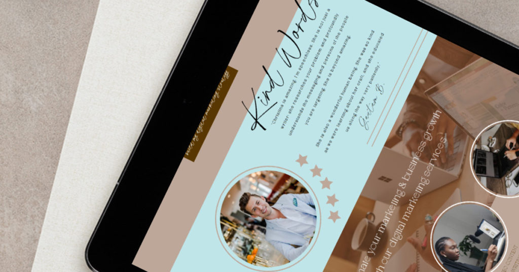
When asked what her favourite part of the website design process was, Christina said “the cohesive aesthetic and cozy feel. [Maggie] totally nailed what I was looking for and made me feel 100% comfortable through the process. Also – those FAQ drop downs and design-specific details really made it special.”
Website Launch
We launched Copybean’s website earlier this fall, and I am SO excited about how it turned out. Here’s what Christina said about working together “Maggie is truly amazing at what she does. She’s an artist who has the technical know-how to make your vision a reality, even if you’re still in the formulation stages of the process. I would recommend Maggie to anyone looking for a major refresh for their branding.”

Help me congratulate Christina and the Copybean team on their successful website launch! And go check out the site at hellocopybean.com!
And if you’re wanting to update your website, hop into my inbox and let’s start building out the site of your dreams!!