Categories
i'm Maggie
Your average Canadian, who loves hot tea, hates socks and helping your business have a show-stopping brand and website
Branding
Design
Websites
About Maggie
Marketing Materials For Church Retreat
Earlier this Spring, I was asked to be the chairwoman of my church’s women’s retreat planning committee. Along with this role, I was able to design and make all the marketing materials and print materials needed for the retreat.
I love planning events, and truth be told, I had always wanted to be a party planner. But then I knew how stressed it made me (from the few large events I had planned) and I decided to not pursue that career.
Being able to be on a team and help plan a retreat was something I knew I could manage.
Marketing the Retreat
We knew the dates, and location, and had a rough schedule—as we were following from last year. So in our early meetings, we choose the speaker and her theme for the weekend. Once I had those settled, I was able to begin the designs to market the event.
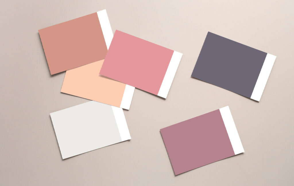
I began first with choosing a colour scheme and fonts—similar to any brand project. These change every year with the theme of the retreat. I wanted to use feminine colours with warm tones, as retreated are about building community, and relationships. I landed on some beautiful purple, pink, and oranges. Almost like a sunset.
Like most events, we needed some infographics to use on the website and registration, the church announcements, and email communication to the members.
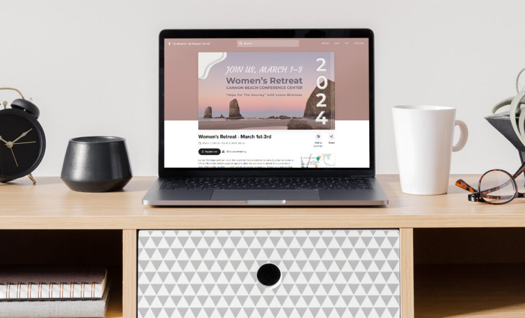
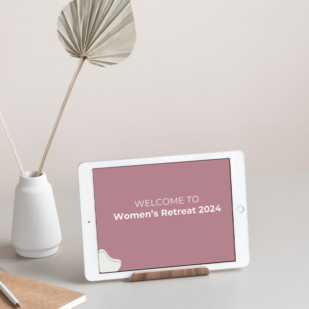
Adding to the Marketing Materials
After I built all the digital assets, I moved to making some posters and flyers to hang around the church. The committee felt it important to keep things easy, so we paired down some of the assets.
Once ready, I began playing around in Illustrator. It was my sandbox and I had fun pulling ideas up and testing to see if they fit the overall theme of the retreat—Hope for the Journey. One woman on the committee shared a photo of Cannon Beach she’d taken and I decided it was the perfect fit for both the theme and the marketing materials.
The flyers turned out perfectly as I began building the overall brand for the retreat.
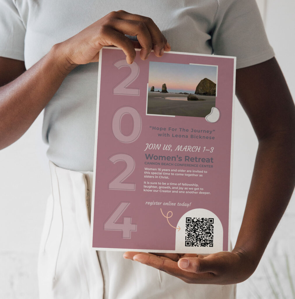
Before registration opened, we agreed to use the church’s new software to sign up online, so I added a QR code to the materials instead of a URL. And we tried to make things more streamlined to send people online. One item we agreed to eliminate was a small flyer for the church bulletin that gets printed weekly.
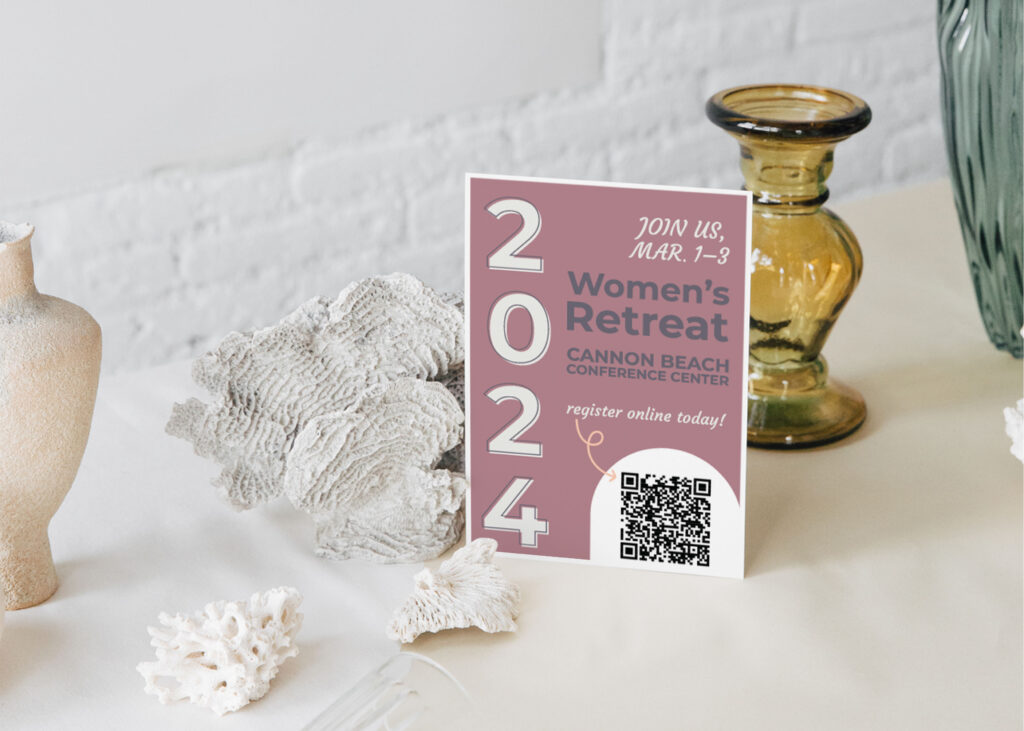
Once registration opened, however, the committee realized that they wanted some small flyers at the registration table, to hand out to women who weren’t ready to register or take home to invite a friend. I designed those quickly and we only printed a few for the table.
Print Marketing for the Weekend
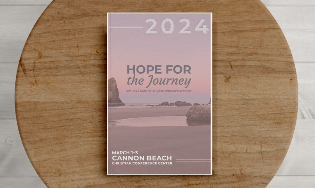
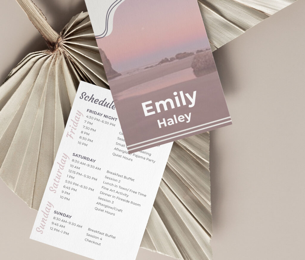
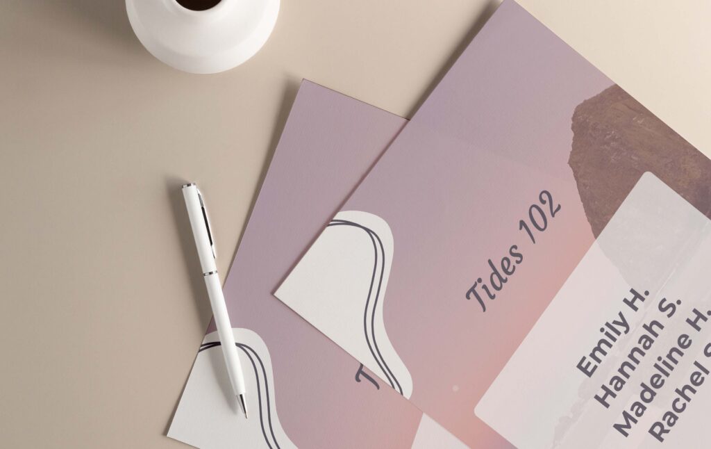
After registration marketing was complete I moved toward designing all the print marketing we’d need to give each woman who attended. This included a name tag, booklet, slideshow for announcements, and room tags so women knew which room was theirs.
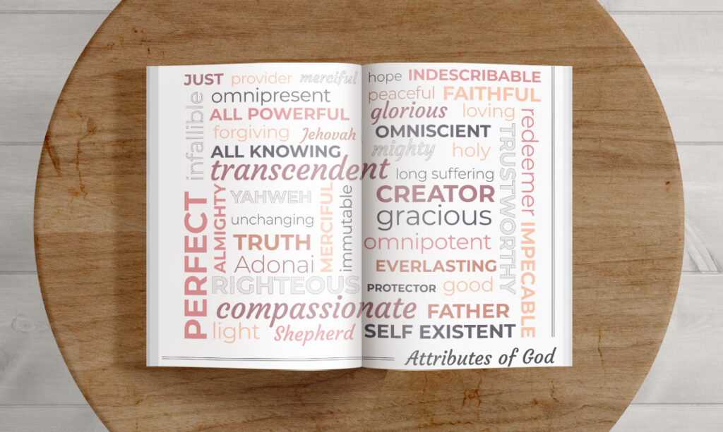
I love designing print material. Making booklets is so much for me. And this one was no exception. I added some fun details like scripture and attributes of God, along with the questions the speaker wanted the attendees to discuss.
The booklet turned into something very beautiful and I’m proud of the overall artwork.
Design Tips for Marketing Materials
Pages in Booklets
Something with booklets—when you are printing and folding several pieces of paper—is that you need to add pages in increments of four, as I was printing double-sided. So if I wanted to add more information I’d have to fill four pages instead of one.
That’s a little challenging when designing and pulling content. I needed to know when to stop Or when to add more information or pages. Typically In client work, they provide the content, but in this case, after I got information from the speaker I got to make up the rest.
Printing in-house versus in a print shop
When you use a standard printer—like what most businesses and homes have—you have to be mindful of the designs running off the page—called bleeding.
I’m sure you’ve seen this before: If you look at something with a full image or colour stretched to the edge of the page on your computer, and then go to print it, it shrinks down and leaves a white border around it. The bleed doesn’t work, right? Well, the reason for that is that professional print shops will print the design on a LARGER piece of paper and trim it down to the result. So the image or colour can bleed off the edge.
I had to keep this in mind when I was designing the booklets for the retreat, as the church printed them in-house (on their standard printer). So I gave some extra margin around my printed materials so they wouldn’t be altered by the print.
Sharing the final product
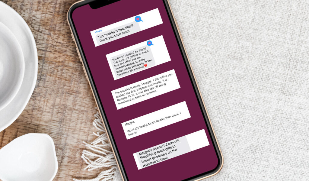
After those got printed, it was time for the retreat! The women who attended complimented my artwork and appreciated the beautiful designs. It was such a joy to create these pieces for the women to enjoy. Here are some kind words from the women on the committee.
Custom Marketing Materials
Hoffman Creative Co. offers custom marketing designs. If you are looking to have some marketing materials made for an upcoming event, reach out to me here and we can get started on marketing your business.