Categories
i'm Maggie
Your average Canadian, who loves hot tea, hates socks and helping your business have a show-stopping brand and website
Branding
Design
Websites
About Maggie
Brand Highlight | Fresh Look Editorial
Jenn popped into my inbox earlier this year looking for a brand and website refresh. After our initial call, I knew that this project would be SO much fun. Jenn edits romance novels and is a book coach (HOW COOL?!). She was looking to take her business away from a previous job site to house all her work in her own space.
We chatted in depth about her ideal client and how Jenn’s approach to editing truly is unique. She provides such wisdom and kindness to her clients to help them grow as authors. She seeks to kindle the flame of their writing passion. You can find out more about Jenn on her social media, and keep your eyes out for her new custom website, which I’ll be sharing once it’s complete!
Initial Brand Concepts
Like all brands I work on, we began by choosing colours and fonts. Then, we found illustrations and icons that can be tied into the brand elements and that work to portray additional feelings.
Jenn and I chatted through various brand icons. I shared several flowers that both tied into the word “fresh” in her business name and into her editing style as well as with her typical genre–romance.
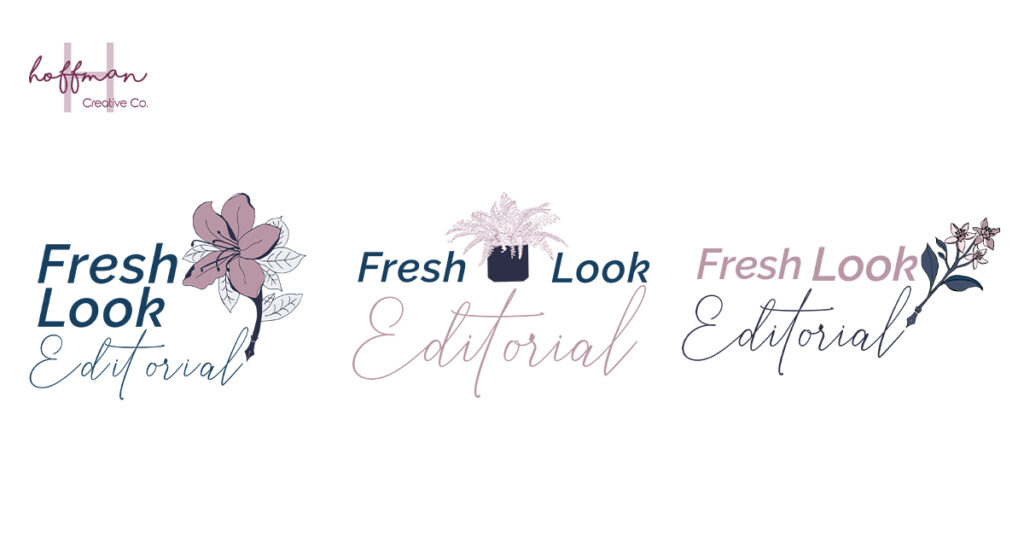
Originally, Jenn chose a fern, symbolizing new life and new beginnings, and an azalea–symbolizing passion and womanhood. We also chatted about incorporating a pen in some way, since she is an editor.
We toyed with the olive branch but felt it was too common. So, in order to be unique, we wanted to stay away from that icon.
As the initial design began, I shared the first round of concepts with Jenn. While she loved them, there was something missing. Something didn’t fit with her vision of her business and ideal client.
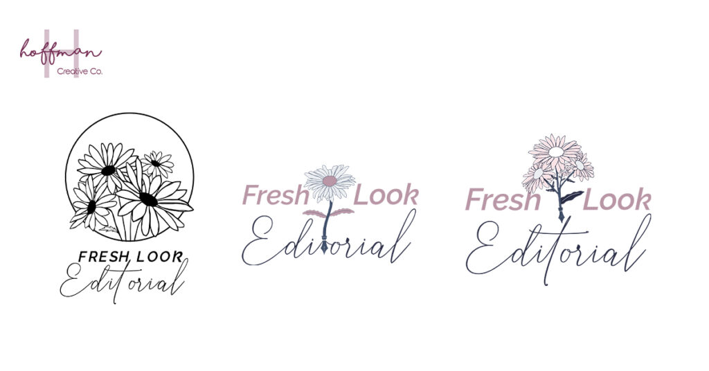
Jenn suggested using a daisy. I went back to the drawing board (my iPad) and sketched up some daisy-inspired illustrations.
Pivoting Brand Illustrations
While I was building out these illustrations, I thought about including a design that was a little out of left field. It was something that Jenn and I hadn’t considered before but would still resonate with her ideal client, be feminine, and be professional.
I decided to make a logo with a look similar to a book spine, with her brand name written as if it were the title of the book.
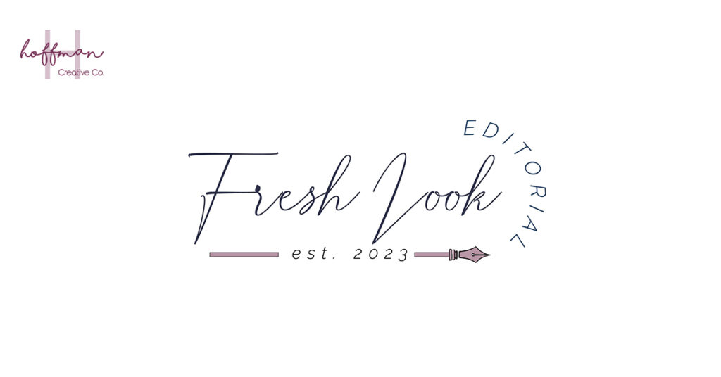
This concept was a hit! “I have to be honest and tell you that I wasn’t expecting it, but I love the design without the flowers. It just looks clean, clear, and professional […] I love the use of the spine for “Editorial.” It’s pure genius, Maggie. :)”
While this pivoted logo was at the forefront of Jenn’s choice, there was one thing that caused us to go back to editing. The “L” in the font that Jenn chose could also be viewed as either a “V” or a “Z”. I began working on creating a custom “L” to match the font and clearly be a prominent “L”.
Custom Hand-drawn Letters
While I had had some practice at editing some fonts, I hadn’t been tasked with editing only one letter before. I began tracing “L”s and shared a few different styles with Jenn to see which one she liked best.
Once we landed on the overall shape, I spent A LOT of time working to perfect the “L” so that it matched the overall weight of the font and flowed nicely.
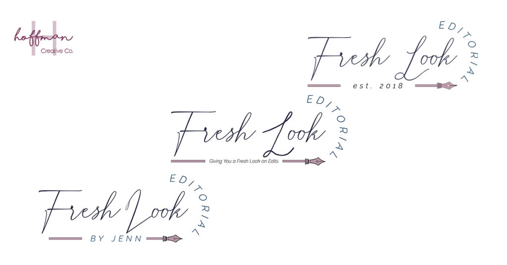
I ended up tweaking and combining different letters from the font to make the perfect “L”.
“I think we are getting so close! I really love the evolution of the logo. I am really excited! You’ve done such a fantastic job, so a huge thank you!”
Final Logo Reveal
Working on this brand was such a fun project. I felt challenged creatively and had so many fun learning experiences–building a custom “L” definitely wasn’t on my radar when we started.
But, finishing up the logo and adding in a custom secondary, sub mark, and favicon completed such a sweet package. “I love everything!” was Jenn’s response when I shared her final versions of her brand elements.
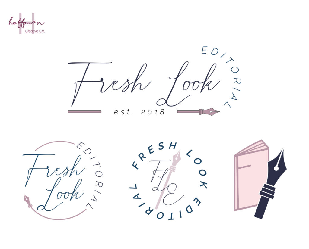
I cannot wait to get started on Jenn’s website. I really think this polished brand is going to be just the right fit for her business and all those she is going to help.
If you’re needing a brand refresh or custom website design, come pop into my inbox, and let’s get started building your dream brand!