Categories
i'm Maggie
Your average Canadian, who loves hot tea, hates socks and helping your business have a show-stopping brand and website
Branding
Design
Websites
About Maggie
Brand Highlight: Modern Motivation
Did you know that I can build out your brand in ONE DAY?!
That’s what I did for Sandy, the owner of Modern Motivation. Sandy and I connected through a referral client of mine, and when we were on the call together, she loved the idea of my Design Intensives—branding in a day.
Sandy originally came to me looking to build out a brand for her company Bloom Motivation, but as we got to talking, and even after our call, she informed me that she was changing the name of her company.
Design Intensives
Within my design intensives, we work at a much quicker pace. Once a client signs me on, we have about 2–3 weeks for the project, with the main design day being done in one day.
So Sandy had to narrow down her vision for Modern Motivation within the two-week timeframe I give my clients. She was on the ball and was able to quickly identify what she wanted and the vision for her new business name.
We had a quick meeting before the design day to review her questionnaire and also talk through some of her inspiration, typography wants, and possible colour options.
About Modern Motivation
Sandy’s business is all about changing the workforce to bring creative, modern, and approachable incentives to employees. She works with companies to help them encourage and maintain their workforce through incentives that are not only financial. Neat, right?!
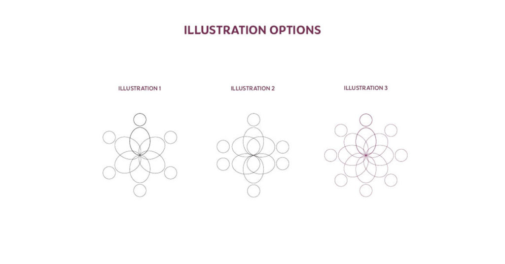
Because Sandy works with people, we agreed that there should be some form of human element in her branding.
Design Day
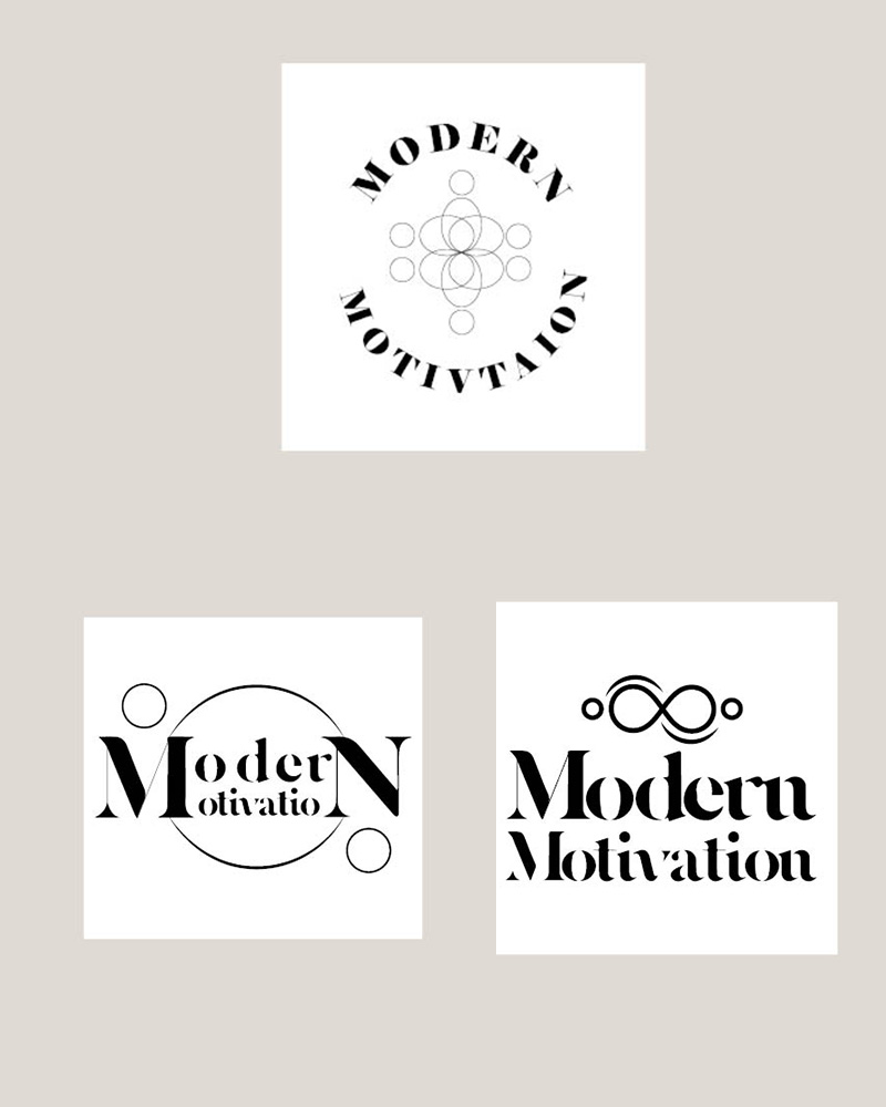
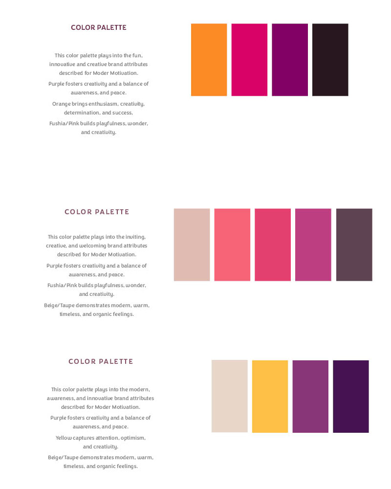
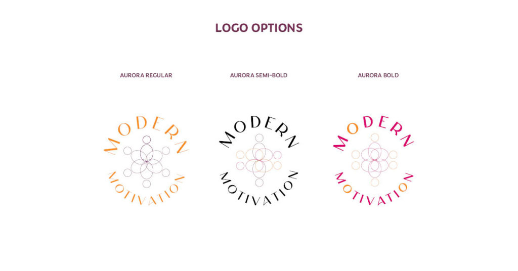
The morning of the Design Day, Sandy and I hopped on a call to review some typography and colours I put together for her business. I had also put together a few mockups of the logo for her to choose from.
We talked through each of the options I provided and Sandy was able to choose a colour palette, and logo concept. We were still trying to play around with one of the fonts I selected.
Sandy wanted warm colours, that popped, while also were unique and stood out among the corporate world. We stayed away from blues, greens, and reds since those are generally prominent in the corporate world.
We signed off and I went to fine-tune some pieces of the logo based on Sandy’s suggestion.
On our second call in the day, Sandy nailed down which font she wanted and then we made the last final edits to her logo while on Zoom together.
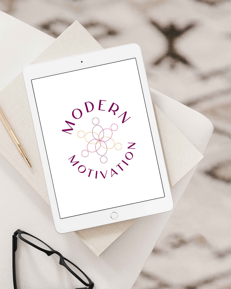
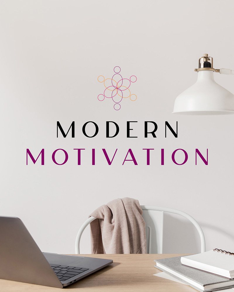
Since Sandy focuses on empowering humans in the workforce, we made sure that the human illustration was at the centre of her primary logo.
Once we nailed down the human illustration we played with some colour and the typography weight. This was the final aspect of building out her primary logo, and a part I love. Being able to tie the whole package together.
Modern Motivation Brand
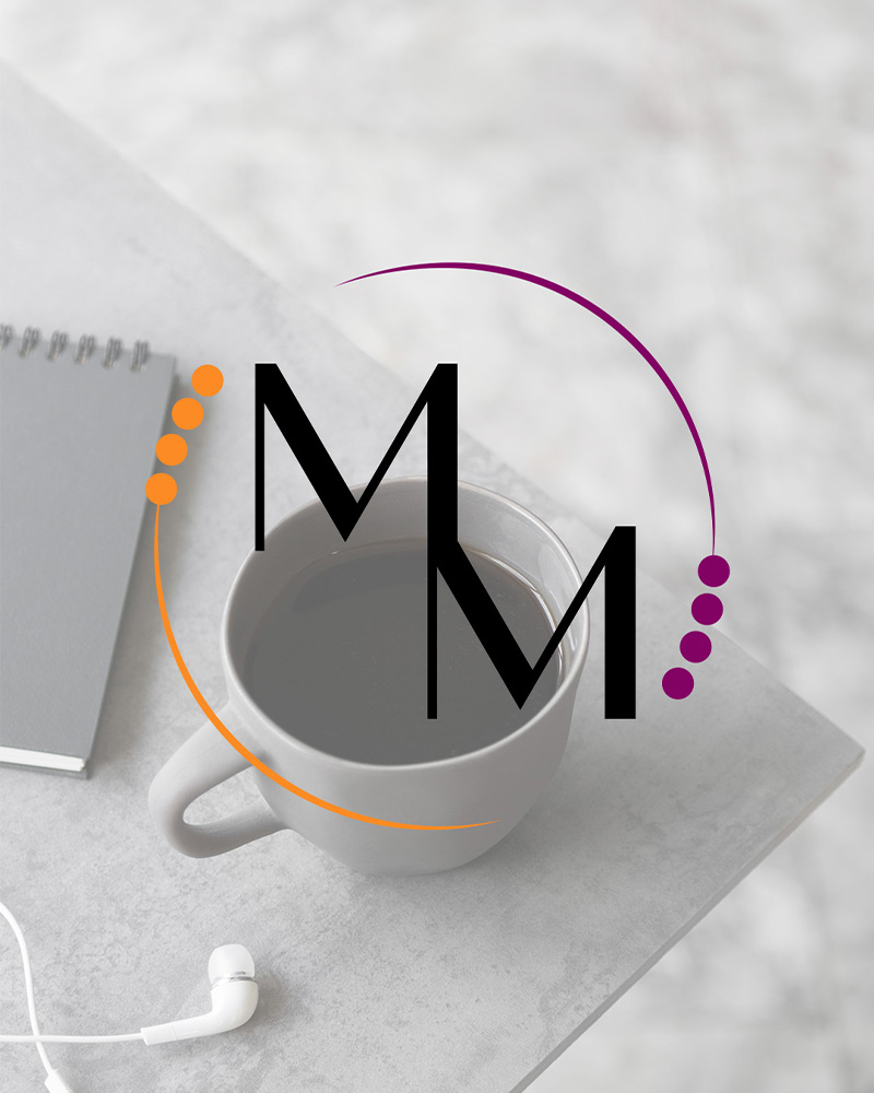
Because of Sandy’s efficiency, we completed the brand in half the day! So I was able to put together some extra goodies to help build out her brand. This included a secondary and tertiary logo, some social media graphics, and a draft homepage layout.
I had so much fun working with Sandy on building her brand, we even were able to work on building out her website—stay tuned for that!
If you are looking to build your dream brand, I’d love to connect and design it with you. I have spots open for design intensives and also my full brand package. Hop on my calendar and we can get started bringing your vision to life.
