Categories
i'm Maggie
Your average Canadian, who loves hot tea, hates socks and helping your business have a show-stopping brand and website
Branding
Design
Websites
About Maggie
Brand Highlight: Kitchen Sink Collaborative
WOWIE! This brand was SO much fun to work on!
Jordan and I have been friends for a few years but hadn’t met in person until the fall of 2021. We both met in a women in business Facebook group and both were starting to build our businesses.
We connected and have been supporting each other for the last few years. Then we finally got to meet at a conference in North Carolina. We were able to chat more about her business and the possibility of working together on her branding one day.
Jordan reached out a few months later, and we started working on her brand for her business, Kitchen Sink Collaborative.
How it Began
Jordan is a social media manager who helps brick and mortar businesses sell beyond their storefront. We met and talked through her ideal client. What she felt they were struggling with, and how her business could support them. We wanted to make sure her brand tied into the area she helped—Kentuckiana—while also being unique to her.
“My favorite part was our initial onboarding call. It was great to voice my brand and vision and see Maggie pick up on important details she incorporated in the final logo design.”
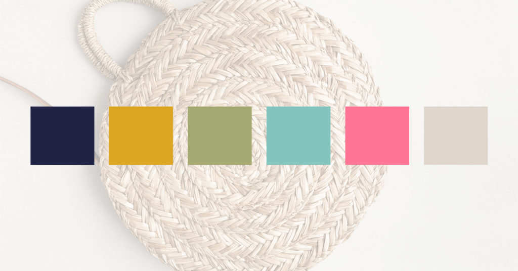
I provided a few colour options for Jordan as well as font options. These were to see what would tie in her vision, and also speak to her ideal client.
She settled on a beautiful colour palatte. It has several pops of colour we both felt would draw in her ideal client.
Custom Illustration
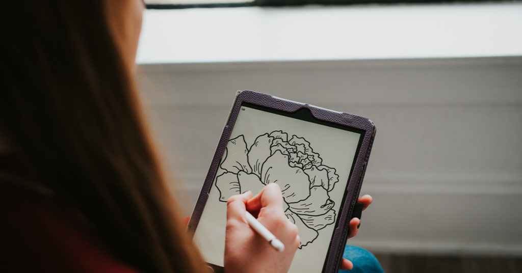
While we were digging into what elements to include in her logo, Jordan suggested a peony as it is the state flower. Since she works with mostly brick-and-mortar businesses, finding another staple in the community helps tie in her brand to her customer.
I set out to draw some peonies for Jordan to choose from. She chose two peonies and I began designing the rest of the logo.
Adding a Tagline
In Jordan’s case, her business name wasn’t obvious as to what she offered. With a name like Kitchen Sink Collaborative, there is a lot left to the imagination. We talked over the idea of adding in a sink to her branding. But felt it didn’t speak to the direction or the audience she serves.
So I suggested we add a tagline to her primary logo which included what she offered. Then I suggested that the other logos I’d deliver in her brand kit didn’t need to have a tagline, as those would be supporting logos.
Finalized Brand
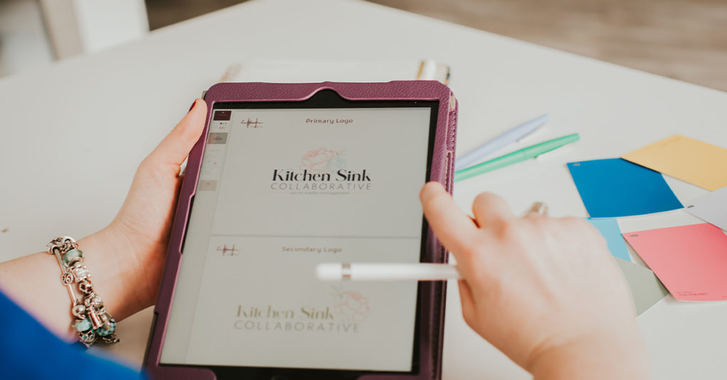
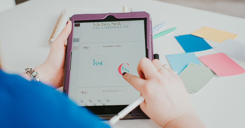
We finished up her brand last month and I’m SUPER excited to reveal it to you. Jordan received a primary logo, secondary logo, sub mark, and monogram. She was such a joy to work with. And if I do say so myself, her brand has become one of my favourites!
When asked how this new branding would impact her business, Jordan said “The logo and branding colors will make my business pop online. It helps me establish my business to new clients as well as showcasing my personality – something I feel a lot of businesses lack or skip over.”
Here’s what Jordan said about working together.
“Hiring Maggie to design my logo was a dream! She was easy to work with, incredibly responsive, and would ask really great questions to make sure the logo design would align to my business’s ideal client. The entire process was so smooth and enjoyable!”
I had so much fun creating this beautiful brand for Jordan. And if you’re in the Kentuckiana area, be sure to look her up and get her to help with your online presence.
If you want to learn more about my branding packages to up-level your business, I’d love to chat. See my package offerings or connect with me via email.
