Categories
i'm Maggie
Your average Canadian, who loves hot tea, hates socks and helping your business have a show-stopping brand and website
Branding
Design
Websites
About Maggie
Brand Highlight: Fortitude Public Affairs
Holli was referred to me by a previous client, Jordan–see Kitchen Sink Collaborative. We chatted about Holli’s new public affairs business and about how she wanted to start out on the right foot by launching her brand and website at the same time.
Holli is a proven leader in Indiana politics, having served as an elected official in both the legislative and executive branches. She began Fortitude Public Affairs with the hope to make government less intimidating for business owners. Her vision is to be the intermediary between businesses and government policies.
Beginning of the Brand Development
I had never worked with someone in government, so Holli and I did a lot of work reviewing her competitors–fellow individuals who are public servants, work in public affairs, and serve as government officials. We dived into discovering her ideal client and the expected results of working with Holli.
Along with that, we talked through Holli’s brand attributes. We considered how she wanted clients to feel and interact with her. We narrowed it down to several words that related to Holli, her work, and the overall tone of the business. Some of those words are
- Strong
- Capable
- Classy
- Innovative
- Effective
- Attentive
Building the Brand Elements
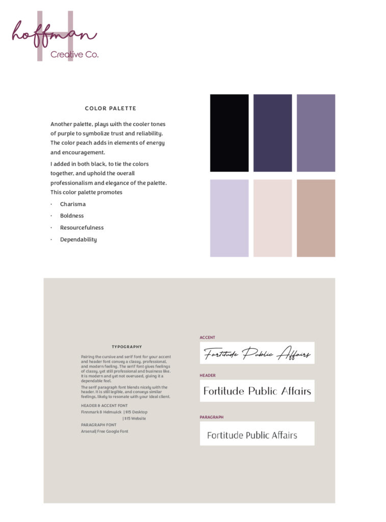
In all of my brand projects, I begin with selecting fonts and colours. I want my clients to choose elements that they like and that, most importantly, will resonate with their ideal client.
Since Holli has extensive experience in government, she and her work history possess boldness. So, we knew we needed a colour palate that would reflect this strength. Additionally, since she isn’t choosing to work on one side of the Indiana State political spectrum, we felt that purple would be a fitting colour to incorporate–blue and red together. This is also tied to the fact that some of Holli’s clients may have to “blend” with whichever political party they are working with to change or adjust policies.

We also wanted to choose a font that would stand out and accentuate Holli’s bold and classy personality. This font selection and colour pairing matched the overall tone of the brand we were building.
Unique Brand Elements & How to Use Them
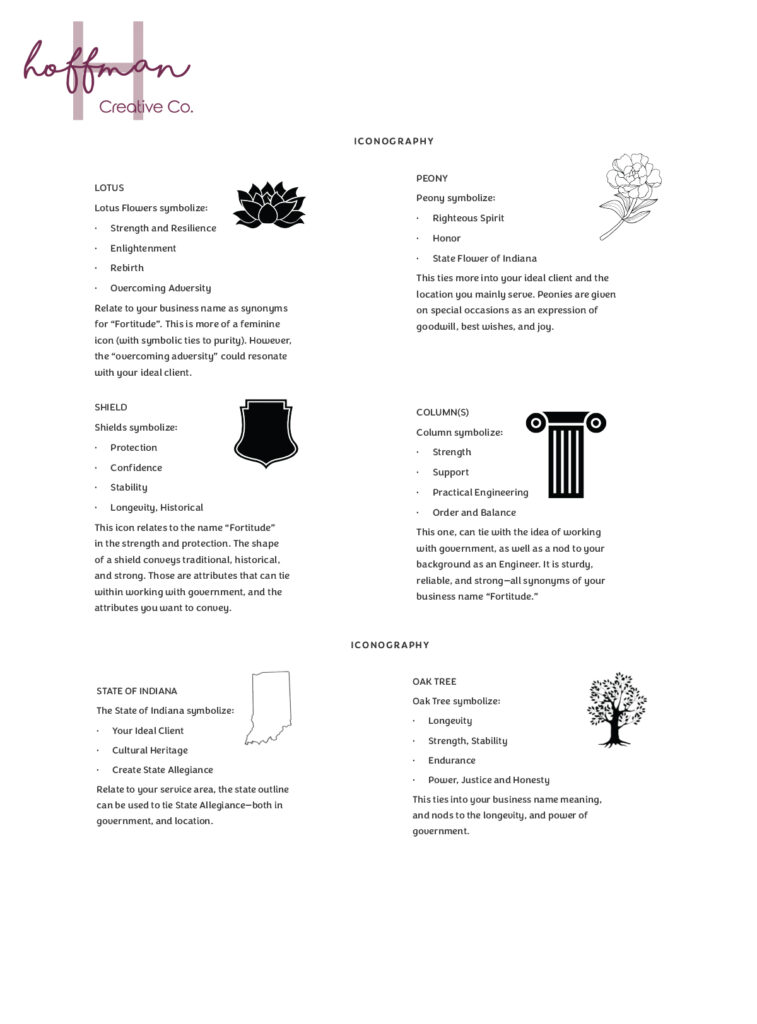
Once we had the colours and fonts selected, I moved into designing some illustrations that could be used in Holli’s brand. I chose elements to present to her that related to the State of Indiana. Since most of her clients live there, we felt it was something we should explore.
I presented a few options that were both related to Indiana and also to the name “fortitude.” We looked at the outline of the state, the state flower–a peony, and a shield. I tried to put my creative spin on all of these elements to give Holli a variety of choices.

Finishing Up the Brand Elements
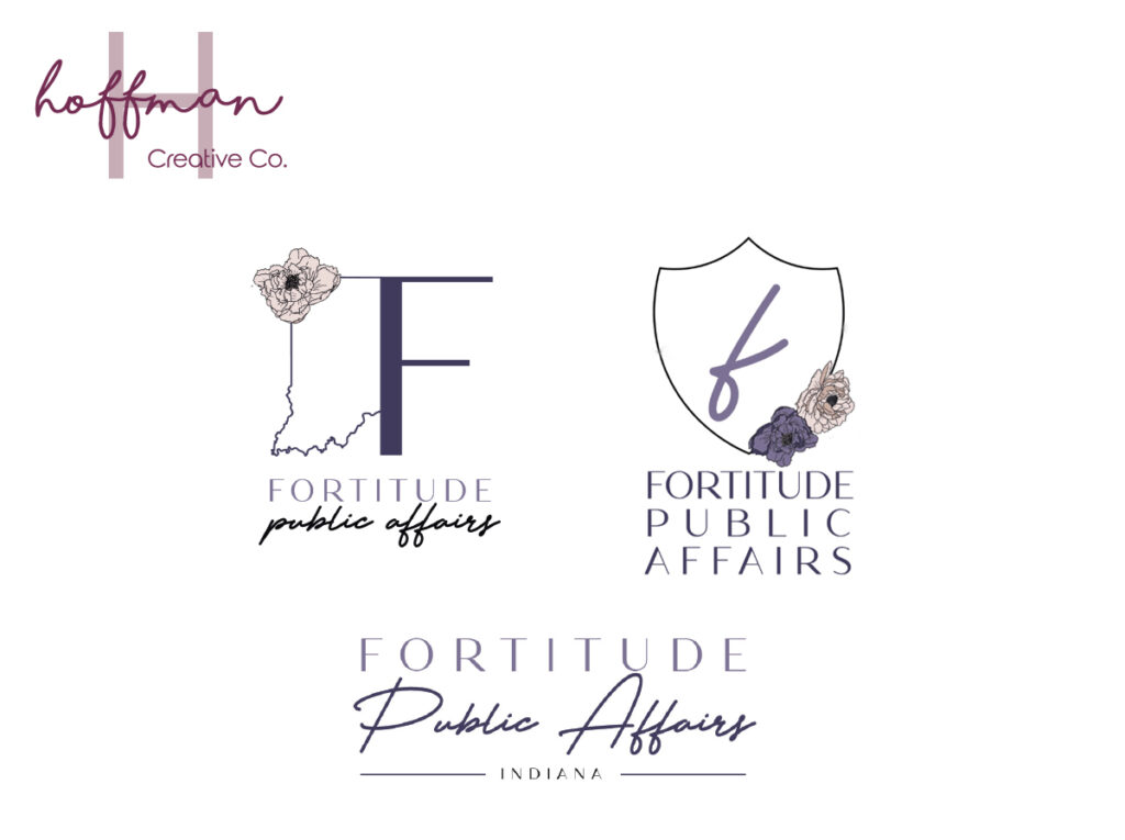
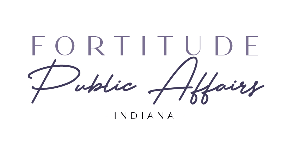
I presented Holli with three concepts that were slightly different, yet they all fit within her brand attributes. As I was building out these elements, I decided to include a very sleek and professional logo option.

Holli’s initial reaction was incredibly positive, saying “First and foremost, I have been so excited to see these and you did not disappoint. I love them. I truly do!”
While Holli loved the concepts, she was drawn to the professional option as she knew we were building her brand for her ideal client rather than just her own preferences. While I had fun trying to combine a shield and a peony, we headed toward the polished and classy logo.

I had so much fun working with Holli on designing her brand, and I cannot wait to share the website we’re working on as well–stay tuned for that!
It was really great being able to work through different concepts with Holli and build out a brand that I know will resonate with her ideal client. Her brand will enable her to stand out from the others in her industry!
I’d love to know what you think about it! Come tell me over on the ‘gram. And, if you’re in need of a brand refresh or a fully custom website design, let’s chat!