Categories
i'm Maggie
Your average Canadian, who loves hot tea, hates socks and helping your business have a show-stopping brand and website
Branding
Design
Websites
About Maggie
Passion Projects: Four Restaurant Brand Concepts
Alright, this is an industry I haven’t had the opportunity to work with yet. But I’d love to be able to design a brand and website for a restaurant. Restaurants are so unique and branding one would be such a great challenge. In the meantime, here are several Restaurant brands that I designed for fun. But honestly, can’t you see yourself eating at one of these local places?
Restaurant Brand: The Port
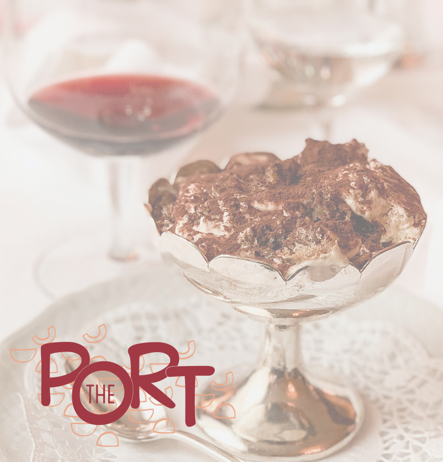
This brand came to me one day as I was visiting my mother-in-law and we went wine tasting. The inspiration was to have an upscale dessert restaurant with a limited menu that only complimented the wines that they grew in their vineyard. A VERY Oregon-style restaurant, in my opinion.
The Port got its name from Port wine, which is typically a sweet red wine. As well, the restaurant would be in Portland. Thus, there is a double meaning to its name.
I built this brand using neutral colours, with a pop of maroon to play into the wine dessert bar.

Brand Elements
For The Port, since they are an elevated dessert restaurant, I incorporated some stacked elements as most fancy desserts have layers and various pieces. I went with abstract shapes because wine is fluid and shows up differently when paired with different foods.
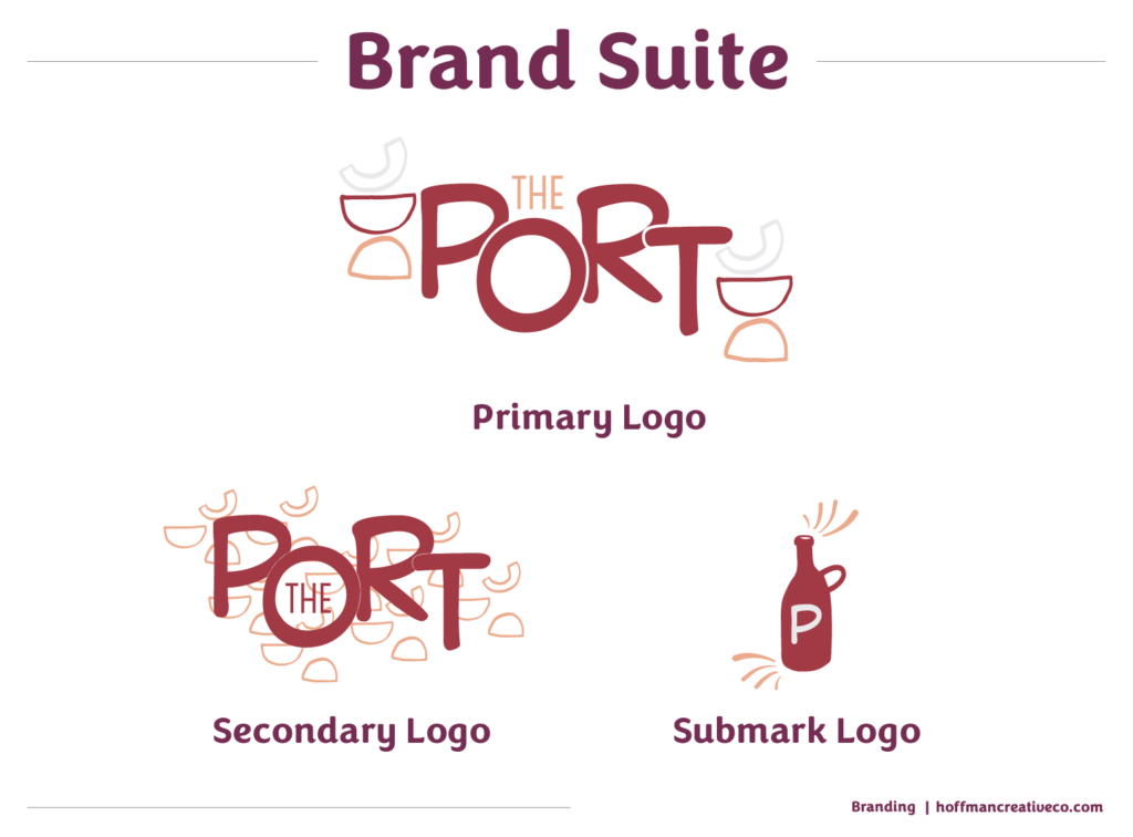
The overall brand was to be playful, elegant, and unique. I could see myself stopping into this restaurant after a lovely day walking downtown Portland. Sipping on wine and diving into a delicious dessert with my husband.
Restaurant Brand: Landon’s
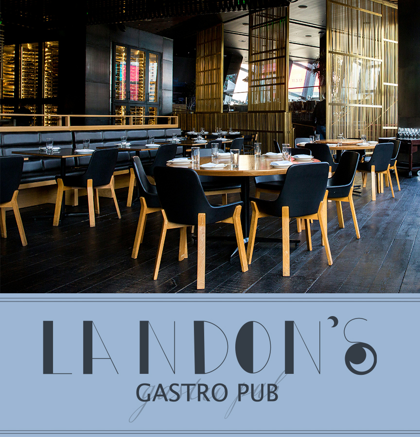
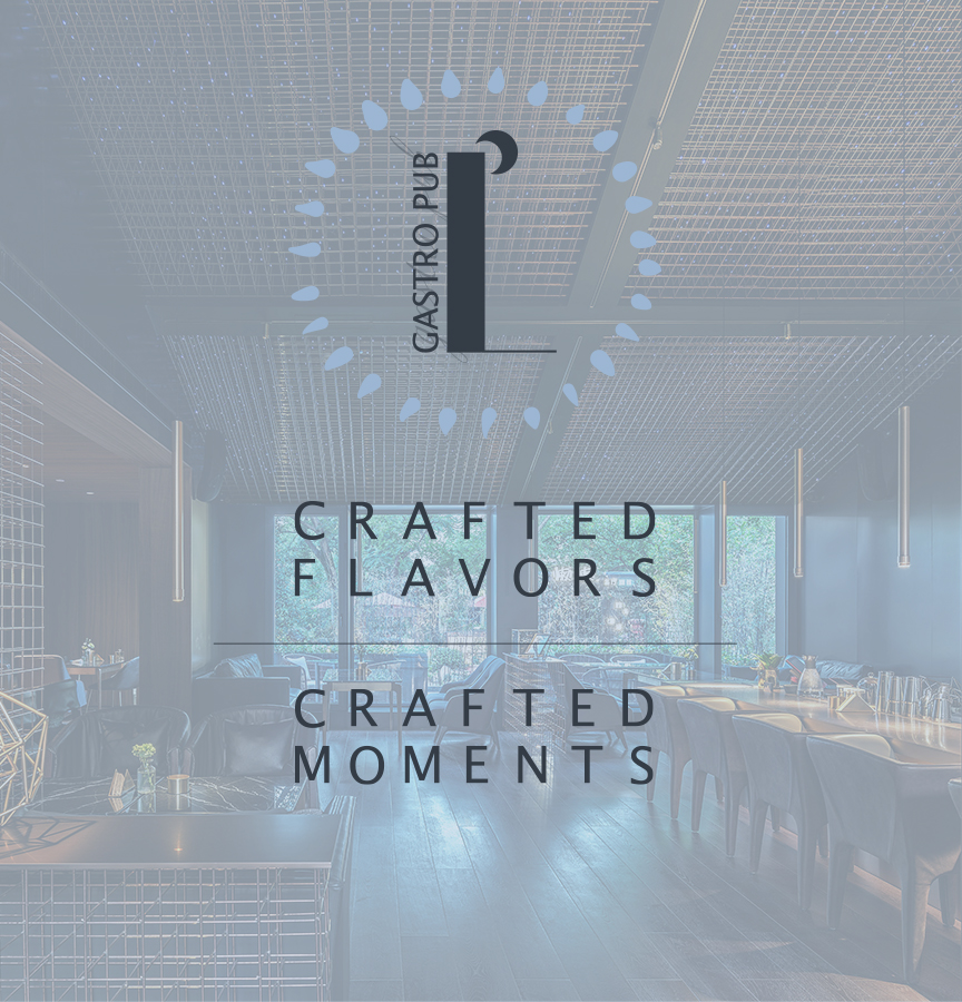
This Gastro Pub was inspired by one of my nephews. Gastro pubs—known for their warm environment and delectable food—host guests seeking a cozy yet vibrant experience. Crafting a brand that resonates with this type of guest, I wanted to add elements that evoke feelings of comfort, camaraderie, and culinary delight.
Understanding the Restaurant’s Brand
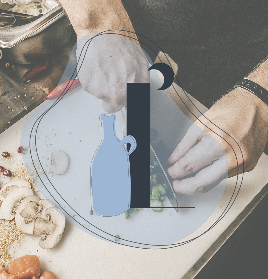
At the core of designing this brand, I wanted to think about its overall tone. One of my favourite gastro pubs that my husband and I like to attend helped stem the inspiration for this brand. It has a curated menu with crafted flavours, is inviting, and creates an environment that fosters connections. I incorporated those pieces in building Landon’s Gastro Pub. Using a mixture of bold and fine lines, as well as curves—all give a warm and inviting tone.
Building the Visual Identity
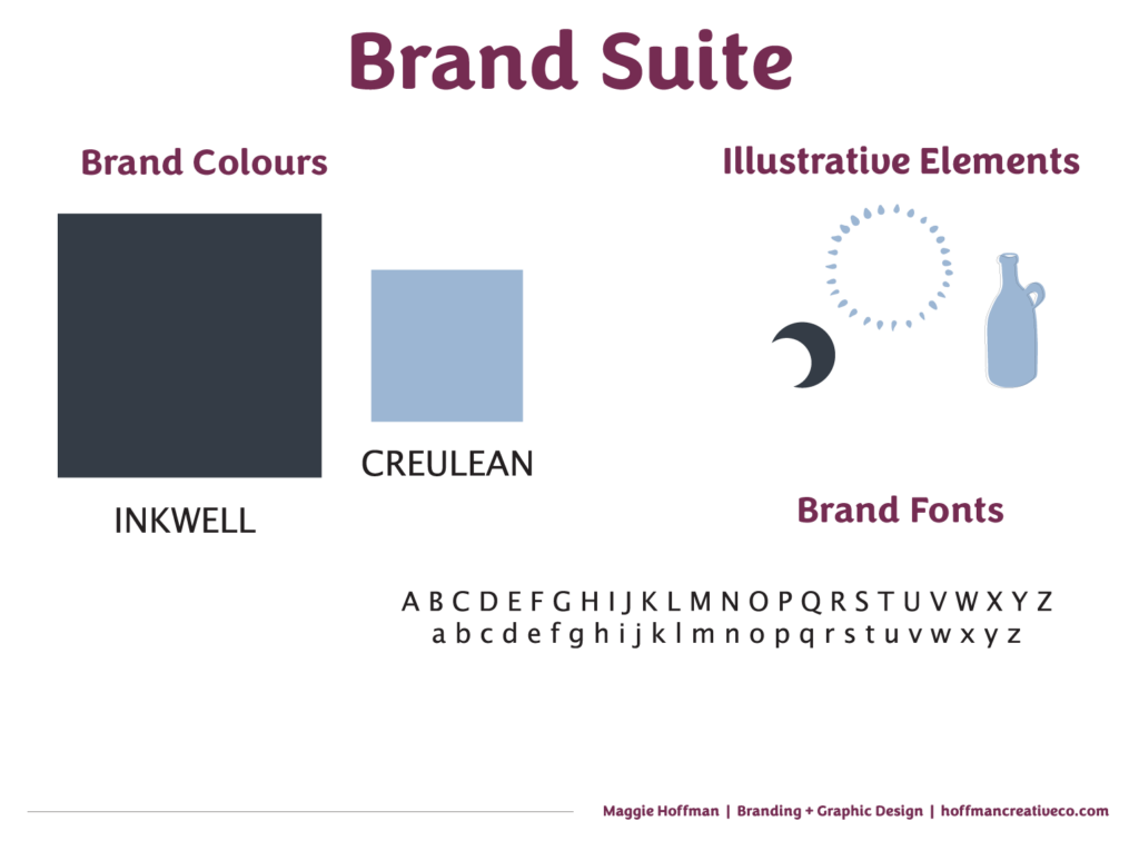
The visual elements of a brand play a pivotal role in communicating its personality. For a warm atmosphere gastro pub, I chose two colours that create a welcoming environment. The blues evoke a sense of peace, calm, reliability, and welcoming. All elements I felt were important to this business. I took what a survey from Marketo said that “95% of the top 100 brands only use one or two colors in their logos.” (Marketo) By choosing two colours I could lean into helping this brand stand out.
Restaurant Tagline
I thought about a tagline for Landon’s, as a memorable tagline encapsulates the essence of the gastro pub. It should resonate with the target audience and convey the promise of a delightful experience. Taglines like “Crafted Flavors, Crafted Moments” can evoke the desired emotions and attract patrons looking for a unique dining experience.
Overall this brand became a fun project for me, and something I could envision both my husband and I making weekly reservations at to enjoy the warm, inviting atmosphere and sharing in delicious foods.
Restaurant Brand: Earthy Eats
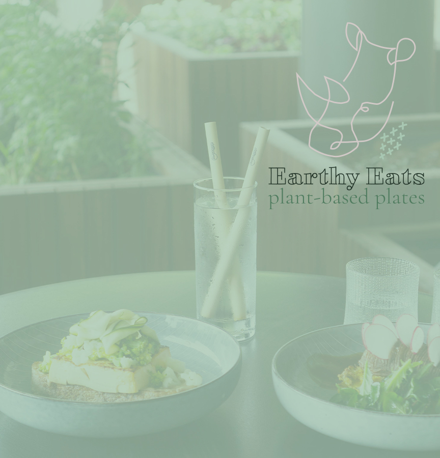
This was a fun project to dream through. It was inspired by a Rhinoceros. Not that I have any personal experience with one, I just thought the endangered species needed a spotlight. After doing some research, I learned that rhinos are herbivores. So I thought that a vegan restaurant could be fun to brand. So, Earthy Eats was born.
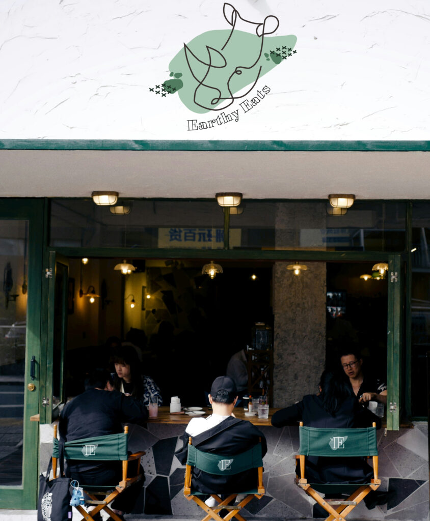
While I am not personally vegan, I do love vegetables and eating whole foods. So it is fun to think about a restaurant that focuses on embodying a lifestyle of health, compassion, and sustainability. Earthy Eats relates to the natural goodness of foods that come from the earth.
Choosing Brand Colours
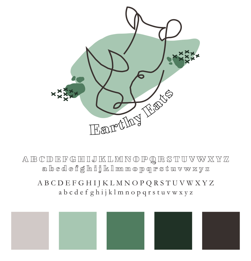
I searched for earthy colors like greens, browns, and muted tones to create a visual identity that reflects freshness, wholesomeness, and a connection to the environment. Envisioning natural tones to be complimented with wood, sand, and stone. I added some graphic elements that felt rustic and whole.
Vegan Restaurant Brand Identity
I thought more about the business beyond just serving vegan food. Earthy Eats can differentiate itself by sharing its sustainability journey. From sourcing local, organic ingredients to minimizing waste through composting and eco-friendly packaging, communicating these practices authentically can resonate with environmentally conscious consumers. Sharing stories of partnerships with local farmers or initiatives to reduce carbon footprint adds depth to the brand’s narrative.
Restaurant Brand: Triton
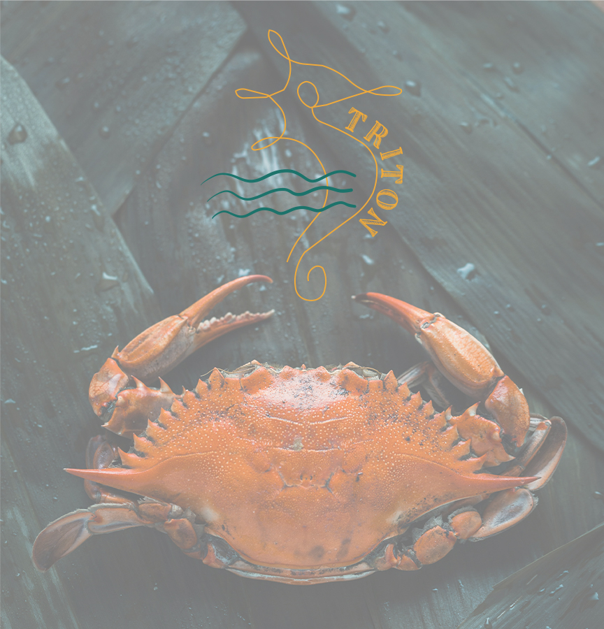
This last restaurant brand is Triton. I envisioned it nestled in the heart of a renowned fishing city. Triton stands as a beacon of culinary excellence, specializing in upscale seafood dining. I chose the name inspired by the sea’s mythological ruler, this restaurant sets sail to delight seafood enthusiasts and connoisseurs alike with its exquisite offerings and oceanic ambiance.

Maritime Elegance
When thinking about the name of a seafood restaurant brand, I thought about a well-known seafarer. As someone who used to live in a port city, with a wonderful seafood scene, I could picture this restaurant elegantly elevating maritime culture.
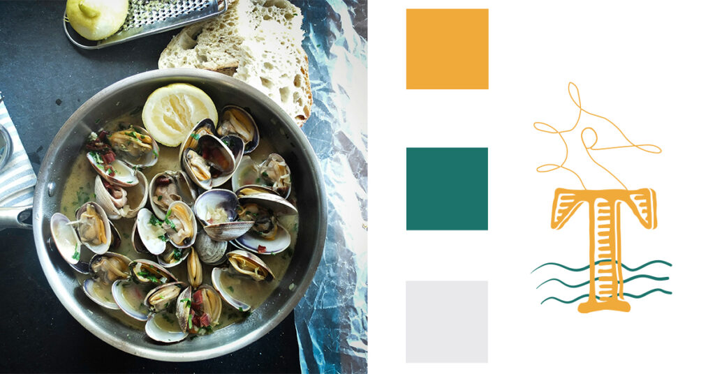
I chose a color palette of blues, aquamarines, and warm neutrals to evoke the tranquil beauty of the ocean. Incorporating nautical elements such as seahorses, bubbles, and worn texture into the restaurant’s design adds a touch of coastal charm.
Luxury Restaurant Brand
When building out this brand, I wanted to use fine-line details (as seen in the seahorse) but also some bold elements, as working on the sea isn’t easy. I wanted to nod to the work of those who caught the fish that would be served at Triton.
Luxurious Dining Experience
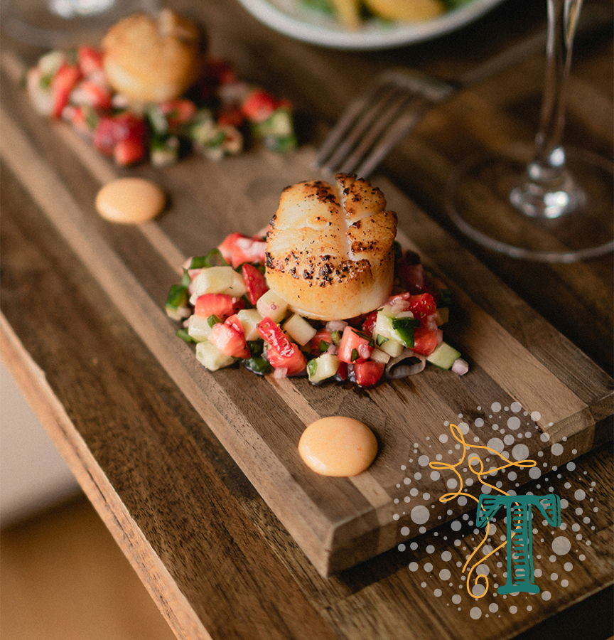
As an upscale seafood restaurant, Triton promises a luxurious dining experience. From elegant table settings and impeccable service to curated wine pairings and waterfront views, every aspect of the dining journey should reflect refinement and attention to detail. The brand strives to create a welcoming yet refined environment where guests can savour each moment and indulge in culinary delights enhancing Triton’s brand as a destination for special occasions and memorable dining experiences.
Final Restaurant Branding
Designing the branding for Triton as an upscale seafood restaurant in a well-known fishing city is a blend of maritime elegance, culinary excellence, and luxurious experiences. I think having a unique maritime name, and sophistication, Triton can establish itself as a premier destination for discerning seafood connoisseurs—that is, if it were real.
What Industry Should I Create Next?
I had so much fun creating these brands, even if they were only passion projects—thinking through the restaurant branding process and envisioning dining at each of these locations. Could you see yourself enjoying a decadent dessert at The Port, a juicy burger at Landon’s, a hearty cauliflower steak at Earthy Eats, and savoury scallops at Triton.
I’d love to know what other industry I could try to create a brand for. Or if you are looking for a new brand, I’d be honoured to work with you! Hop into my inbox, or DM me on the ‘gram to chat!
Disclaimer
The custom brand built by Hoffman Creative Co. is a passion project, not for an actual client. The names and businesses in this post are fictional. All images in this post are from unsplash.com