Categories
i'm Maggie
Your average Canadian, who loves hot tea, hates socks and helping your business have a show-stopping brand and website
Branding
Design
Websites
About Maggie
What is Visual Hierarchy?
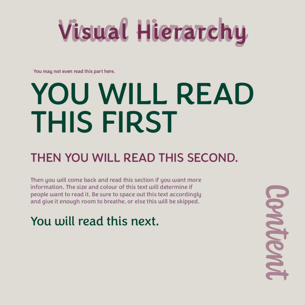
Visual hierarchy is a design principle that explains how pieces are organized. Designers use this principle when creating various forms of content by putting important information in easy-to-find spots.
There are two different patterns of visual hierarchy that I’ll explain later. But first, we will start with the importance of it.
Why Visual Hierarchy is Important?
It’s important first for designers to know that where we place content on a webpage, poster, or booklet, matters.
Not only does placement matter, but knowing that the viewer who consumes the content will follow a pattern with their eyes and only see certain pieces of the information.
And if we know that, then we, as designers, can be strategic and intentional about where we put information. Especially important information.
It’s important to display the most information information in ways that draw attention to the viewer.

Visual hierarchy in action
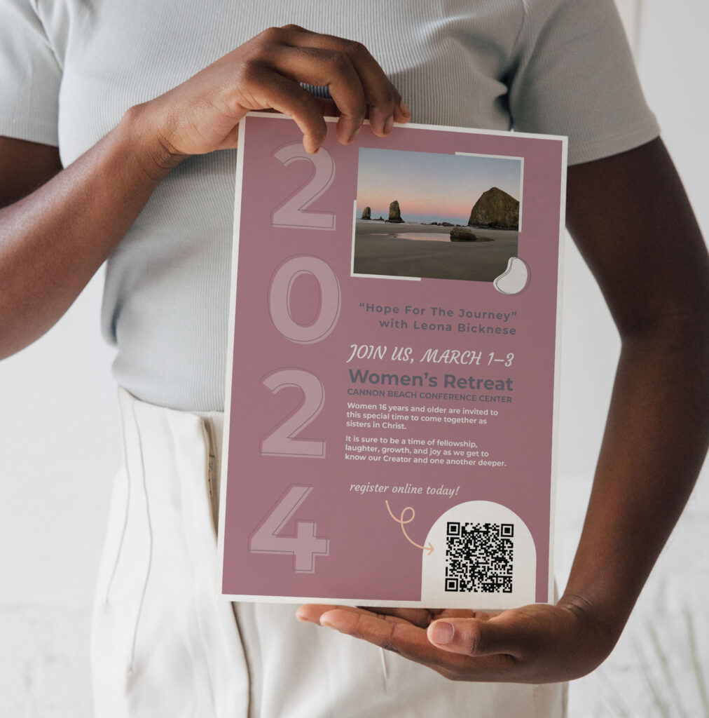
Think about it when you see an event poster. Chances are you’re not reading every line of text in order from top to bottom. You follow the pattern that the designer has laid out or jump around to read pieces based on larger text, or colourful text.
This is also why some people won’t have all the information about an event because they scan the invitation and only look at the pieces that stand out, or follow the visual pattern.
Why non-designers should care about visual hierarchy
If you’re not a designer by trade, but create content for your business, you’re going to want to care about this principle.
Following the example above about an event poster, if you know not everyone is going to read it all. Think about the most important information and emphasize that in your design.

What is the most important information?
- Where the event is
- When the event is
- What the event is
Listing these and making them easily visible to the viewer will help you both out. Finding creative ways to highlight them—larger text, different colours, put on a background colour, etc. Will show their importance, but also make it easier for the viewer to find what they’re looking for.
Think of another example, your website. You will want the most important information at the top of the page so users don’t have to scroll endlessly to find out the answers to their questions. This is key in the visual hierarchy.
Utilizing visual hierarchy online is helpful to turn visitors into customers.
Patterns of Hierarchy
There are two common patterns that people tend to follow when they look at content. The “Z” and the “F” pattern.

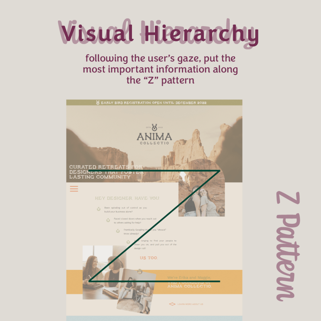
“Z Pattern”
Is like it’s name. Viewers follow a Z pattern as they scan the content. Going from left to right, diagonally down to the left again and back to the right.
Keeping this in mind, it can be helpful to design with pieces following that pattern. This design pattern is great for websites.

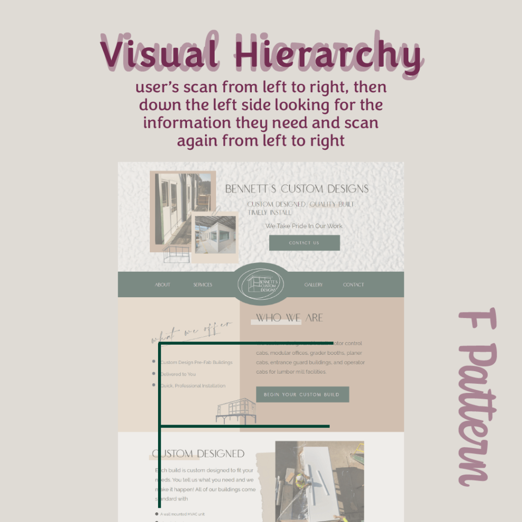
“F Pattern”
Like its name, viewers look at content starting at the top left and then scan right. Then down and right.
This pattern is great for websites and also printed materials.
Going Forward With Your Designs
As both designers and non-designers, it’s helpful to know these patterns as we create content. Keeping both the pattern people read and scan text, but also ensuring the important information is at the top can truly help create clarity for your users or target audience.
Good marketing is about creating less confusion and making the decision to take the next step as easy as possible. And visual hierarchy is a tool you can use to do that.
Next time you go to make a piece of content try to design with one of these patterns in mind, and see if you also have an easy time finding the important information.
Do you like tips like this? Let me know if it was helpful on Instagram, or email me, maggie@hoffmancreativeco.com. And if you want help designing attractive and eye-catching marketing materials, let’s connect.