Categories
i'm Maggie
Your average Canadian, who loves hot tea, hates socks and helping your business have a show-stopping brand and website
Branding
Design
Websites
About Maggie
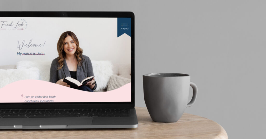
Website Highlight: Fresh Look Editorial
*There are affiliate links in this book editor website blog post, all that means is if you shop from one of my likes, I’ll get some thank-you money from the service provider.
Wow! This project has been one for the books! (literally, because Jenn is a book editor—too punny? Sorry haha)
I had the pleasure of working with Jenn on both her brand and website. You can peek at her custom brand here when you’re done reading this one.
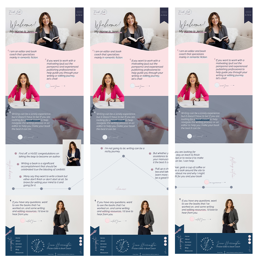
After we designed her brand, I wanted to make her website easy to use, creatively show her portfolio, and have nods to her industry—book editing. I worked hard to make it look unique as a book editor website.
Book Editor Website Featuring a Customized Experience
It was really important to me that both Jenn and her ideal clients felt seen and resonated with her work, and how I displayed it on the website.
“There is always a lot of competition out there for clients, so I think this website represents me and my business while walking the potential client through the experience.”
So with that, I began thinking of some fun writing elements we could include in her website. One is the plot triangle. You know the “rising action,” “climax,” and “falling action” triangle we learned how to use in elementary school?

Well, I had a thought about how cool it would be to have that added to the site, and better yet, have the plot triangle scroll horizontally versus vertically. So I pitched the idea to Jenn, and she loved it!
I set out to find a way to add a horizontal scroll to a website and found The Seedling Studio. A course with code to help customize Showit websites. And I was able to get the code working!
Now it’s one of my favourite parts of this website. Check out the scrolling function here!
When asked Jenn’s favourite part of the website, she said “can I say everything? I think it just looks smooth and professional. The color palette is beautiful, combined with the logo and branding, it gives the potential client all the information. It’s smooth, logical, and user-friendly. The design is visually beautiful. It’s smooth and engaging while looking different. I feel like my website will now be memorable to potential clients.”

Feels like reading a book
There were pieces I also tried to include on the website that would give the viewer a feeling like they’re reading a book.
One of these elements was the navigator. It opens almost like a book would.
Another was sharing her testimonials. Where they flip through like you’re turning a page.
We wanted the website to fit in with authors, and allow them to feel connected with Jenn.
“Maggie’s friendly and attentive messages to help keep me on track or the ask more questions was great. She helped me push through my nervousness with launching my website and gave me confidence in the beautiful platform she created.”
Highlighting A Unique Portfolio
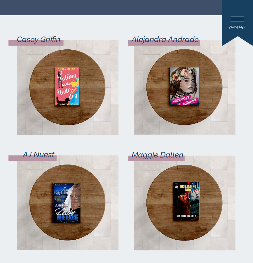
Since Jenn had an extensive portfolio, we wanted to showcase it uniquely.
Instead of having all her work laid out commonly, I suggested we add some movement to the page. Make her work interactive.

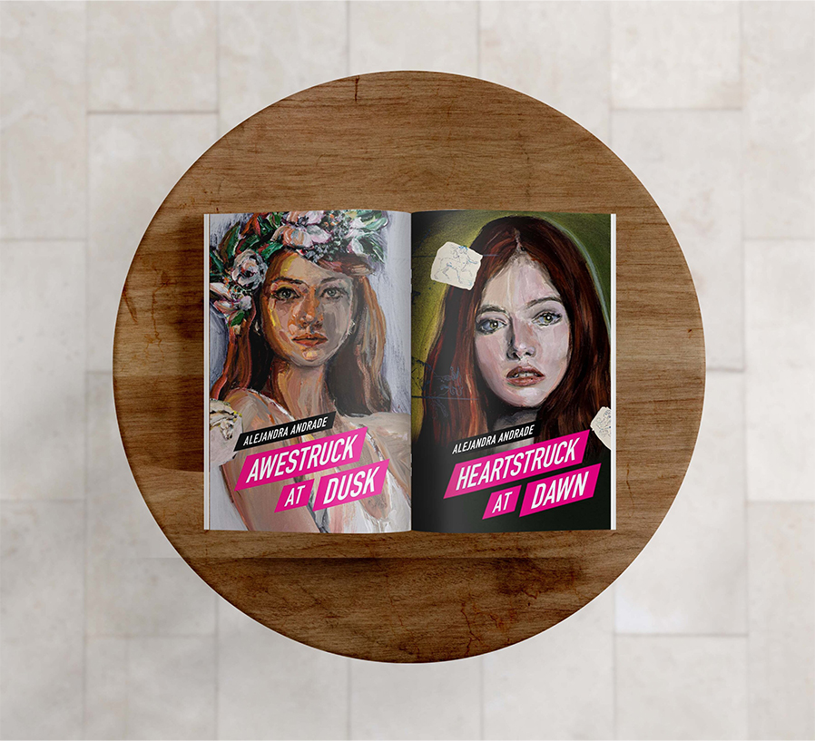
I was able to use mock-ups from Moyo Studio and customize the book covers on a table set. Then using Showit’s transitions and canvas views have the books move. Almost as if you were flipping a book yourself.
It was pieces like these that made the website truly unique and so fun to work on. It also helped that Jenn trusted me with my creative visions and let me try some fun new things! I think this book editor website truly stands out among her competition, and I hope it helps Jenn’s business.

Working With Hoffman Creative Co.
Jenn was so amazing to work with. I saw how much she cared for her clients in the way she talked about them, and strived to serve them through the website design process.
She even had some sweet things to say about working with me.
“Right from the first call, it’s clear that Maggie truly cares for each project she takes on. She’s not looking to make the generic cookie-cutter website or branding design. She inspires and motivates her clients to really dig into what they want and will engage potential clients. Maggie takes care of her client from the start of the project until the end with her friendly, easy-going communication and helps to redirect if you get off course. Her process is easy to follow, and she always delivers on her end. She’s beyond fantastic to collaborate with.”
Thank you, Jenn! I love your website so much and how it turned out, even better than planned!
If you want to have a custom website for your business, what’s stopping you? Let’s chat about how we can turn your ideas into a dream website!