Categories
i'm Maggie
Your average Canadian, who loves hot tea, hates socks and helping your business have a show-stopping brand and website
Branding
Design
Websites
About Maggie
Passion Project: Jessica’s Travel Blog
This passion project stemmed from one of my childhood best friends, Jess. I’ve known Jess since 2002. Over 20 years of friendship. Jess and her husband LOVE to travel. They’ve been around the world visiting some amazing places like Australia, Mexico, Thailand, and Scotland. To name a few. This passion project came about for a fictitious travel blog.
I dreamed that if Jess started to write a blog, she could use this brand to help build travel guides, and share the best places to visit, and local treasures for her travel.
Stand Out Travel Blog
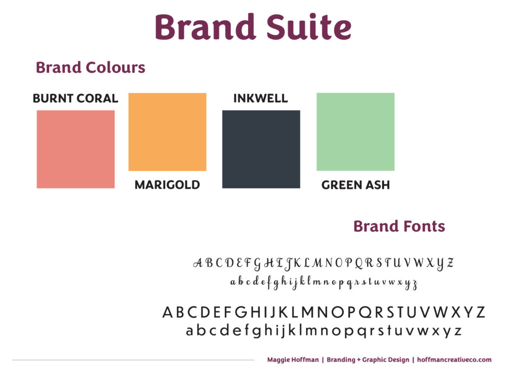
I began choosing the brand colours and fonts like I typically do with all projects. I wanted to choose colours and fonts that would make Jess’ blog stand out, and also resonate with people who would be travelling.
When choosing brand colours and fonts, I work with clients to establish what brand attributes they want to portray. Since this was a passion project, I made them up based on characteristics of Jess.
Brand Voice
- Kind
- Warm
- Genuine
- Casual
Brand Attributes
- Informative
- Community-minded
- Generous
- Unique
- Stylish
- Feminine
- Creative
From these pieces, I pulled some colours that were warm, bold, and similar to the Olympic rings—which also relate to the colours of country flags. As this is a travel blog.
Building the Travel Brand
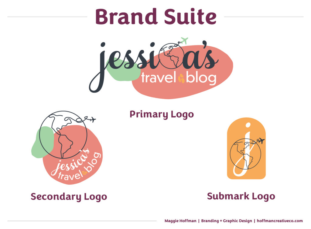
Once I settled on colours and fonts, I began sketching the logos. Since this is a travel blog, I felt that the globe and a plane needed to be used in iconography.
One thing to be mindful of when creating logos is that you want the pieces to blend with the overall brand attributes, but also have them relate to the business. So while it may be a bit cliche to have a plane, it also makes the brand recognizable.
I wanted to use some delicate pieces since Jess is stylish and intentional. Having a line-drawn globe and plane helped bring a feminine aspect to her blog. Then the addition of two mishappen shapes gives the impression of creativity and exploration.
Where to Put the Travel Brand Assets?
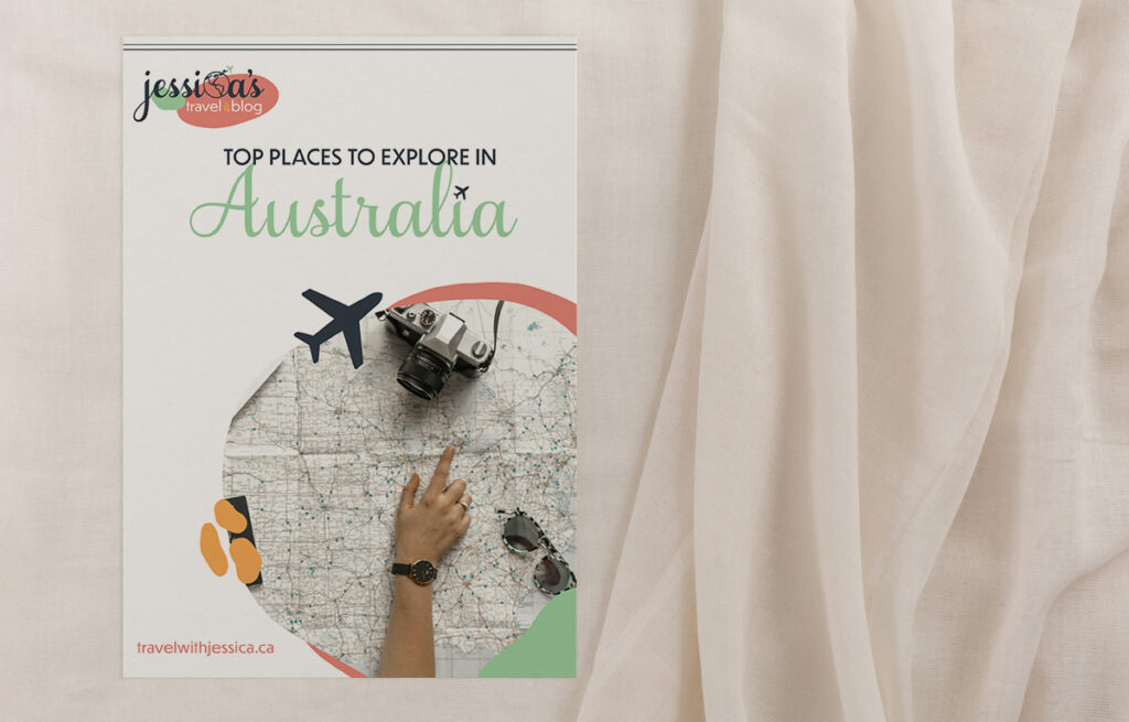
If this were a real business, Jess would be able to take these assets and use them on her website, social media posts, and any print materials. Since this is a blog, Jess would need multiple assets to help market her travels.
That is why I provide multiple variations of the logos. I want them to be versatile, and exported in various colours to help all my clients use them. This helps the brand be cohesive. When you can use similar pieces in different ways you provide a seamless user experience, and build brand affinity.
What Industry Should I Create Next?
I had so much fun creating this brand for my friend, even if it was only a passion project. I’d love to know what other industry I could try to create a brand for. Or if you are looking for a new brand, I’d be honoured to work with you! Hop into my inbox, or DM me on the ‘gram to chat!
Disclaimer
The custom brand built by Hoffman Creative Co. is a passion project, not for an actual client. The names and businesses in this post are fictional. All images in this post are from unsplash.com