Categories
i'm Maggie
Your average Canadian, who loves hot tea, hates socks and helping your business have a show-stopping brand and website
Branding
Design
Websites
About Maggie
Passion Project: Citrus and Lemon
This passion project is a fun one, and I love how it turned out. There was a clothing shop I discovered a few years ago with this name and I LOVED their clothes. I still do, a lot of what I wear is still from their shop. This was a brand design I had fun making.
One day I was looking for something fun to redesign and I saw one of my favourite sweaters from Citrus & Lemon next to me. I decided it would be fun to rebrand them.
Brand Design Process
The boutique had a really basic and very simple logo, in my opinion. I felt it could be livened up, and also add in some personality.
From the outside looking in, I assessed that the boutique’s target market was young professional women in their 20–30s. I thought that a bright colour palette would play into their business name.
A big item I wanted with this brand design was to have their brand stand out among other clothing stores I saw online. I thought a play on their name, of including orange and lemon tied into the “citrus” aspect of their name.
Building the Brand Design
This one was a little harder, as I didn’t want to go childlike with bright and too wild colours. But I looked for a palate that still conveyed professionalism. But it was warm, welcoming and friendly.
Typically with real clients, we talk through what brand attributes they want to display and the tone of their brand. I assumed those here and made up attributes I felt they held based on following them on social media.
Brand Voice Attributes
- Welcoming
- Fun
- Creative
- Silly
- Informal
- Talking with your best friend
Brand Values
- Authentic
- High-quality
- Fashion-froward
- Unique
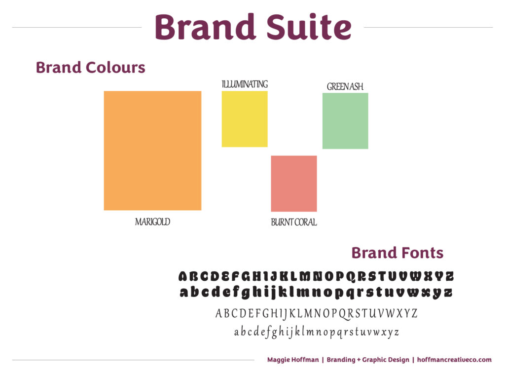
I chose warm colours that reflected the brand attributes. And the tones of those colours are not childlike.
The fonts, I had some fun with and finding fonts that played into their creativity, and uniqueness. I wanted them to stand out as well. A lot of online clothing shops have generic fonts. I thought that the pop of fun in their header text, would help them stand out in the clothing boutique industry.
The Brand Suite
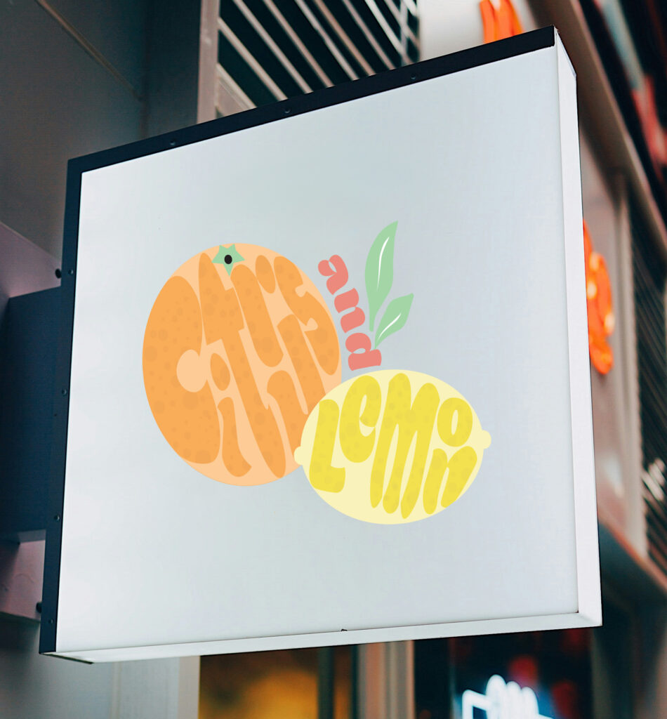
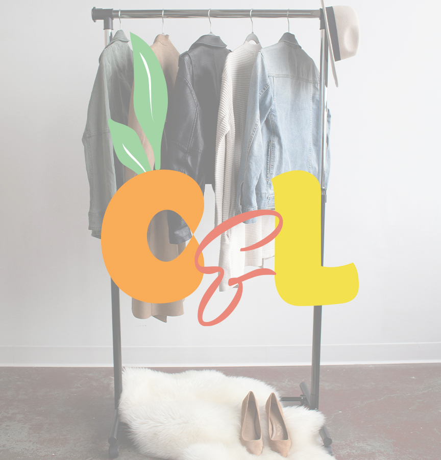
After I nailed down the fonts and colours, I began sketching out the primary logo. This logo can show up on their website, storefront, and signage.
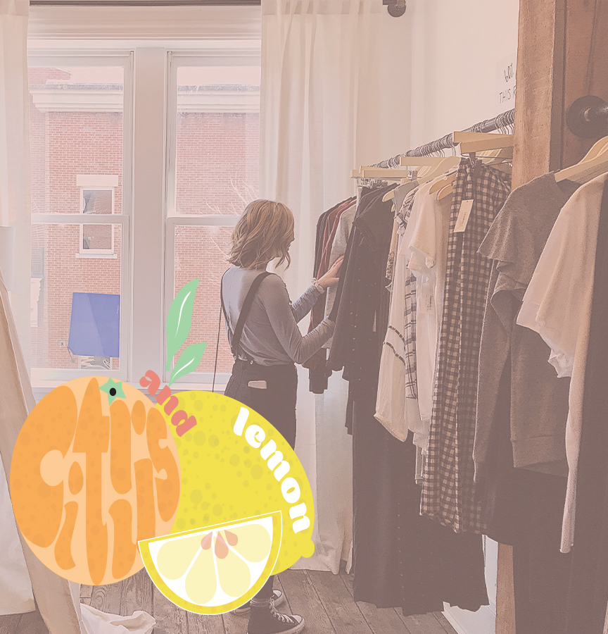
I wanted to play with the shapes of an orange—citrus fruit—and lemon. I thought it would be fun to use both the text and shapes to help identify their business through a unique brand design.
Once happy with that, I began building out the rest of the suite by including a secondary logo, tertiary logo, submark, and favicon.
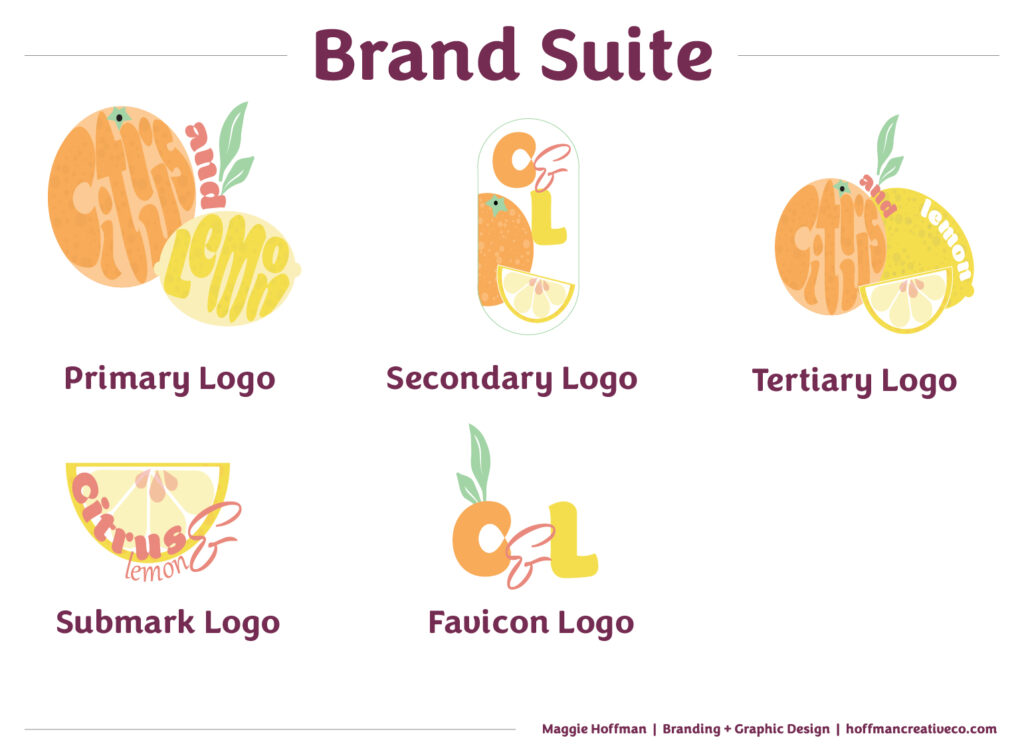
To build a well-rounded brand, placing each of these logos in different spots builds cohesion and affiliation. Each piece is strong enough to stand alone but also unique enough to stand out.
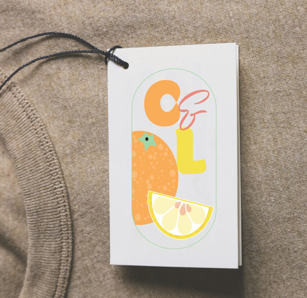
Some of these could be used for packaging, social media, or larger print materials. Once I started to design these, I ran with the creativity.
Passion Project Wrap-up
While this was a fictitious project, I had so much fun creating the brand design and elements. Something I hope that Citurs & Lemon would be proud to display.
I got to play with some new styles of shapes, textures, and a pop of colour that I normally don’t touch with my other client’s work. I love the overall look of this brand, and maybe one day I will get to work with them!
What Industry Should I Create Next?
What do you think of this rebrand for Citrus & Lemon? I’d love to know what other industry I could try to create a brand for. Or if you are looking for a new brand, I’d be honoured to work with you! Hop into my inbox, or DM me on the ‘gram to chat!
Disclaimer
The custom brand built by Hoffman Creative Co. is a passion project, not for an actual client. The business is real, however, Hoffman Creative Co. was not hired to create this brand. The elements in this post are made for a creative project. All images in this post are from unsplash.com