Categories
i'm Maggie
Your average Canadian, who loves hot tea, hates socks and helping your business have a show-stopping brand and website
Branding
Design
Websites
About Maggie
Showit Help: Edge Locking

Edge Locking
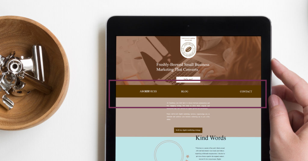
Picture this, you’re working away on your Showit template and finally, have everything in the right place. You go to preview the site and then you see all your menu links jumbled together on one side of the screen. Or elements stretching to the edge that should not be stretched?
If this sounds familiar, it’s likely you have elements with edge lock on.
Edge lock is a function Showit has made to allow elements on your website to extend to, or stretch to the edge of the screen regardless of the width of the viewer’s window size. This handy tool is nice when you want an image or background color to go to the left or the right of the screen and translate well. So it does not sit in the centre of the screen.
But it’s also a little bit of a pain when things overlap and you don’t know why. I filmed a short video walking through the edge locking to help you!

Horizontal Edge Locking
There are three types of horizontal edge locking functions. Note, these functions are only available on desktop editing, as you can pull elements to the edge of the mobile screen and they will translate well on mobile devices.
The horizontally locked elements will follow the window/screen size of the user.
Left or Right Locking
This locks the element to the edge of the screen (either left or right) and keeps the aspect ratio. So regardless of the user’s screen size, the element will keep its proportions and lock to the edge you’ve selected.
Left or Right Stretching
This stretches and locks the element to the edge of the screen but doesn’t keep the aspect ratio. So this function is great for text boxes and colour blocks. Some images may get warped as they are stretched to the edge.
Full-Width Stretching
This stretches the element across the whole screen and touches both the left and right edges as the screen grows.
Watch this video to see examples of horizontal edge locking.

Vertical Edge Locking
There are three types of vertical edge locking on both desktop and mobile editing. But these are only available when you have the canvas set to “Grow with Content” or “Window Height.”
The vertically locked elements will follow the canvas size, not the window size.
Top and Bottom Locking
You can lock an element to the top or bottom of the canvas height while keeping the aspect ratio. So the element will not be compromised as it is locked to the top or bottom.
Top and Bottom Stretch
The element will be stretched to the top or bottom from its current placement on the screen. So the element on the canvas will stretch to the canvas size, not the window.
Full-Length Stretch
The element will stay locked to the top and bottom of the canvas as it grows.
Showit Template Checks
I’ve seen a lot of people ask for help regarding elements with edge lock on. So be mindful that if you’re using a Showit template, the menu items or elements on the page may be locked.
This simple solution can sometimes cause the biggest headache—I know!
How to Edit With Edge Lock
Did you want to see how the locking elements work as I edit a site? Check out this video to see an explanation.
If you get stuck while editing your Showit site, feel free to pop into my inbox and let me know how I can help. I want you to succeed my friend.
M