Categories
i'm Maggie
Your average Canadian, who loves hot tea, hates socks and helping your business have a show-stopping brand and website
Branding
Design
Websites
About Maggie
Brand Highlight: Pandemic Academic Tutoring
Wanna hear a fun story?
I was scrolling through Facebook in late 2020 and saw an old friend from summer camp share that his wife was starting a new business. I decided to comment “congratulations! If she needs any help with marketing, let me know!”
I kinda threw it out there. Not really thinking much of it. Since this friend and I had not spoken since we were both in high school. He replied thanks. Then his wife joined the comment thread and said “yes, I’d love some help!”
She and I hopped on a short Zoom call to talk more about her business. She too began a 2020 business. Rachel began a tutoring company in 2020 to help students who were now forced to work and learn at home.
Rachel didn’t have a very large budget. She had completed her website. But she said to stay in touch if she needed anything else.
A few weeks pass and I get an email from her. She asked for help with the flyers that she made. She felt they were not getting any attention and wanted some feedback on them.
Providing Feedback and Updates
One of the things I offer is feedback on your designs along with creating new a new document for you. Rachel asked for feedback on the flyer she had made.
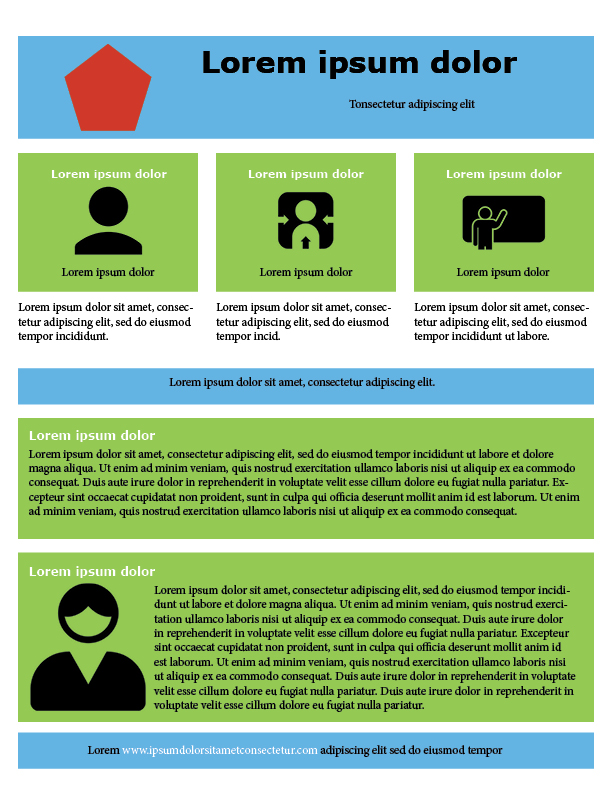
The flyers were a little crowded. It was a simple solution. They needed a keen eye to add some white space. A designer term for more room on the page around the elements.
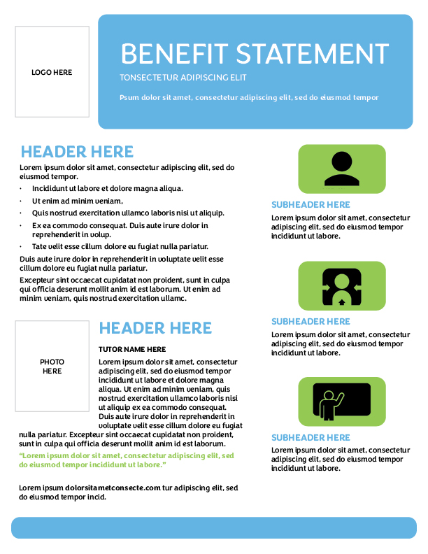
She sent this below. So I began editing. I created a template she could use to update the flyer and make it more eye-catching.

A Designer’s Edits
I happily took to editing the flyer and spruced it up. Rachel had a lot of the elements there. She only needed some guidance on where to put things. And how to add more white space.
The green bars were very hard to read through. As the text and the background colour fought for the viewer’s attention.
Similarly, the amount of text was very long. This can overwhelm the reader and have them stop reading.
Something to keep in mind when you create a flyer, booklet, brochure:
- Make sure it’s easy to read
- Catches their eye
- Put the most important things close to the top
The Updated Flyer
I wanted to keep the elements Rachel had put on the flyer. But make it easier to read and appealing.
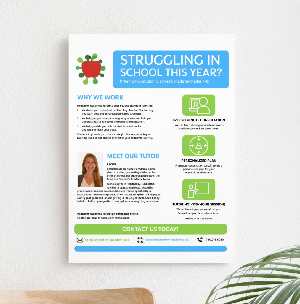
One of my favourite parts of design is giving it some breathing room. Spreading things out and playing with boldness and colour really can make a difference.

I sent this template back to her and Rachel was ecstatic! She loved the cleanliness of the new design and how it all worked together.
I was so happy to help her with it. And a few weeks later she needed to make some updates to it. So Rachel reached out and asked for some more help tweaking it.
The Final Version
And if you ask me, I think the final version turned out SO well! I love how clean it looks. I ensured the elements on the page held their own space. Nothing on this new flyer was fighting for your attention.
What do you think?

Our Work Expereince
Rachel was such a joy to work with, and here’s what she had to say about working with me.
“Maggie was AMAZING! I just started my own business and tried to do marketing from scratch, but it just wasn’t working. She helped me come up with an approach that was totally authentic to my company’s vision and is getting me on track to build up my company with so much more success. Maggie is not only very skilled in marketing and graphic design, but she is also professional, responsive, and genuinely caring about the success of her clients! I would recommend her to anyone!”
Friends, I was SHOCKED. Who knew a simple Facebook message offering to help someone could turn into a great partnership. And also a boost of confidence right when my business was starting off.
If you need some help with a design or are stumped on creating some materials for your business, look no further. The stress you’re going through trying to tweak it is not worth it, my friend. I’m happy to take it off your plate and give you a breath of fresh air.