Categories
i'm Maggie
Your average Canadian, who loves hot tea, hates socks and helping your business have a show-stopping brand and website
Branding
Design
Websites
About Maggie
Brand Highlight: Bennett’s Custom Designs
This past fall brought on a lot of fun projects. One is the brand design of Bennett’s Custom Designs based in Florida.
The Bennett’s came to me through a referral and we signed on in September for a brand + website design.
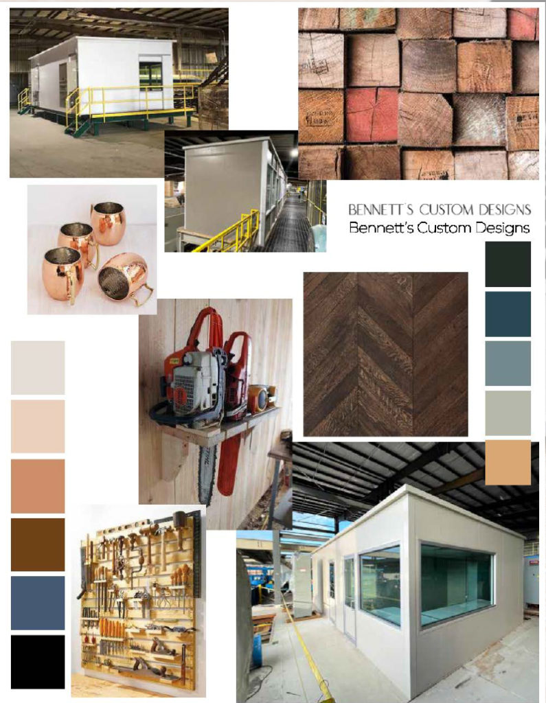
They are a custom prefab building company that designs operator cabs, office buildings, or modular office buildings for lumber yards in the SE.
I had never worked with a construction company before, so this was a fun project to work on.
Initial Designs
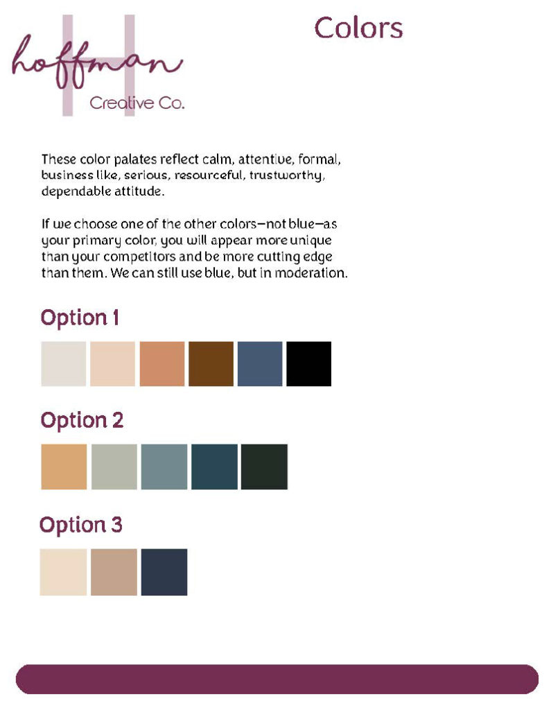
After the Bennett’s filled out my brand questionnaire we hopped on a call to look at their competition. Realizing that a lot of other companies who build prefabricated buildings used blue and lacked personality.
BDC was founded by Lem Bennett Sr. in the ’90s, and his business took off because of the care and personalization he put into each custom build. His son, Lem Jr. takes the same care and precision with their builds today.
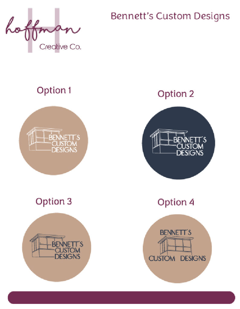
We wanted to make sure that their new branding touched on that personal details. And we both agreed that having one of their buildings be incorporated was best.
Narrowing the Design
We ended up choosing a custom font for their business. The font had both a script font and sans-serif font that complemented each other.
We customized their colour palette to include some green, blue and tan.
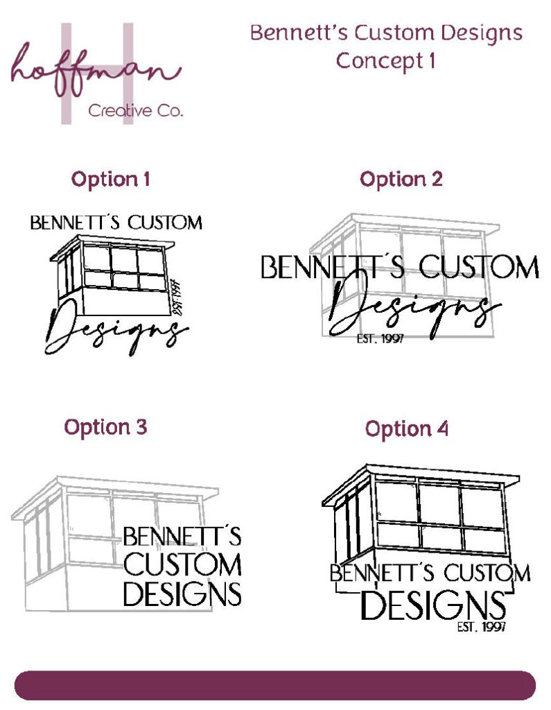
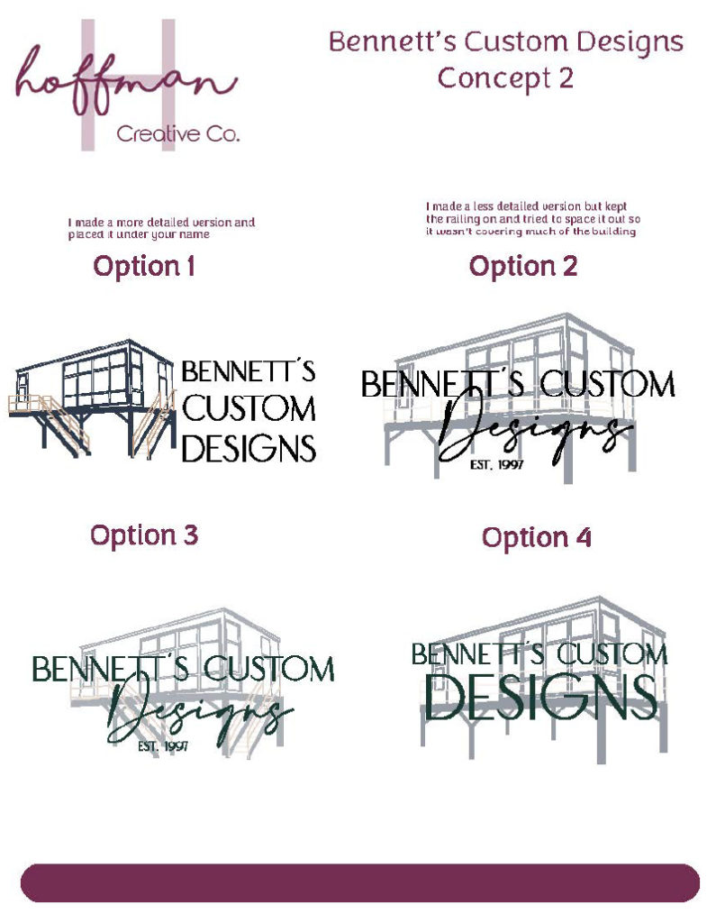
After I sketched two of their buildings, we were able to narrow in on which building they liked best. I used my iPad to sketch out the buildings which really felt more personalized.
We choose either the smaller custom operator cab building or the full-panel cab building.
Finalizing the Design
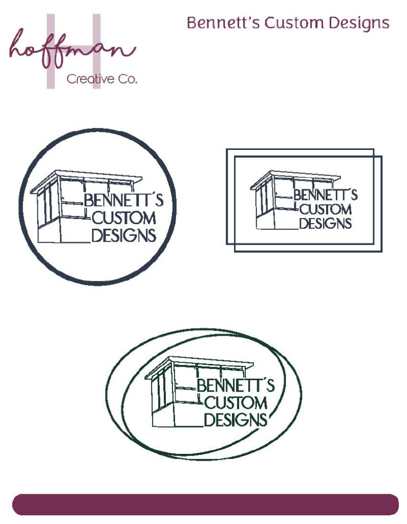
The Bennett’s were more drawn to the smaller cab building. So I began working on touching up that building and finding the right placement of their name. We knew that the block sans-serif letters would work best for the primary font for their logo.
We liked the idea of incorporating another shape to help tie in the whole building and name, to help resemble completion. As the Bennett’s completely build, install and deliver their buildings to clients. So we worked on incorporating a circle into the logo.
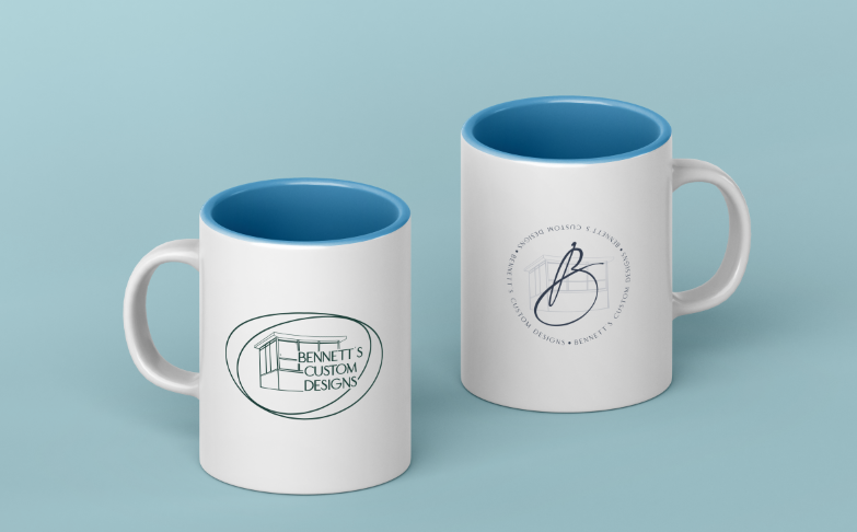
After a few back and forths and revisions, we finally landed on the finished logo. We choose the double ovals to surround the custom cab building, in forest green.
What they Received
With my branding clients, I provide a fully custom brand that includes
- Primary Logo
- Secondary Logo
- Sub Marks
- Business Cards
- Fonts + Colours
- Brand Guide
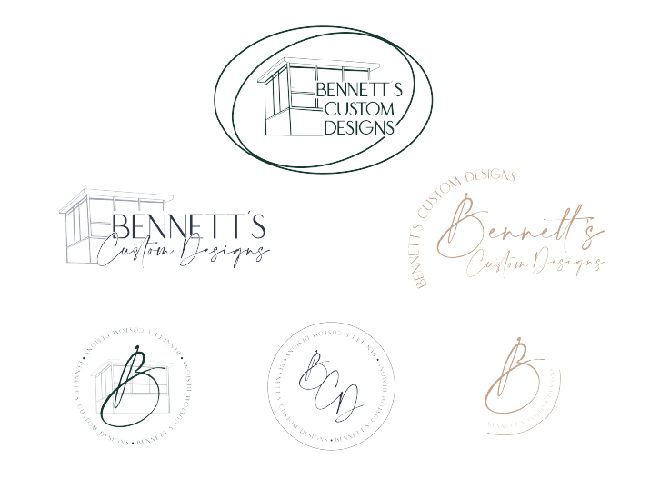
The Bennett’s received their brand with several logos to choose from, as we got really excited with the sub marks, secondary and tertiary logos.
This was such a fund project to work on, because it pulled me out of my comfort zone and the Bennett’s trusted me in my creativity to bring their brand to life.
Rebecca and Lem left a really kind review, I wanted to share it with you.
“Maggie was wonderful from our very first meeting. She was always prompt and organized, knew what she was doing and talking about. I also have to commend her on her patience with us in making decisions but also knew when to step in and let us know what would look best. Maggie was able to bring our ideas to life and we could not be happier with the end result. Our brand just speaks to our business now and our website is beautiful and functional. I felt like Maggie went out of her way to learn our business and understand our target audience which helped tremendously. The end design was perfect! She also offered a payment plan which I loved.”
I’m super pleased with how this brand come together and I love that I got to design their website based on the brand I built. Keep your eyes out for the website details, but if you want a sneak peek, check it out at bennettscustomdesigns.com.
